
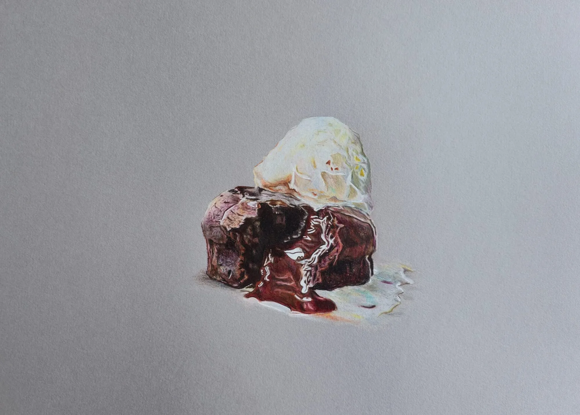
Coloured pencil has a reputation for being slow and hard to control, but most of the frustration comes from one habit: trying to get the finished colour in a single pass. A drawing that looks like a photograph is not made from a few confident strokes. It is made from dozens of light, deliberate layers, each one nudging colour and value a little closer to the subject.
This guide is the map for the whole cluster. It explains the core workflow from first plan to final highlight, shows how the techniques combine, suggests the order in which to learn them, and links to a dedicated guide for each one. If you only read one page before picking up a pencil, make it this one.
The core workflow at a glance
Every realistic coloured pencil drawing follows roughly the same sequence, whatever the subject. The steps below are the backbone; the rest of this guide expands on each.
- Plan your values. Decide where the darks, mid-tones and lights sit before you add colour.
- Lay out the drawing. Place the main shapes accurately in light line.
- Build base colour with light layers. Cover the areas gently and keep the tooth open.
- Deepen. Add shadow and saturation gradually, layer over layer.
- Refine. Sharpen edges, add detail and correct colour.
- Burnish. Polish selected areas with heavy pressure once layers are complete.
- Lift highlights. Remove pigment to recover light, sparkle and corrections.
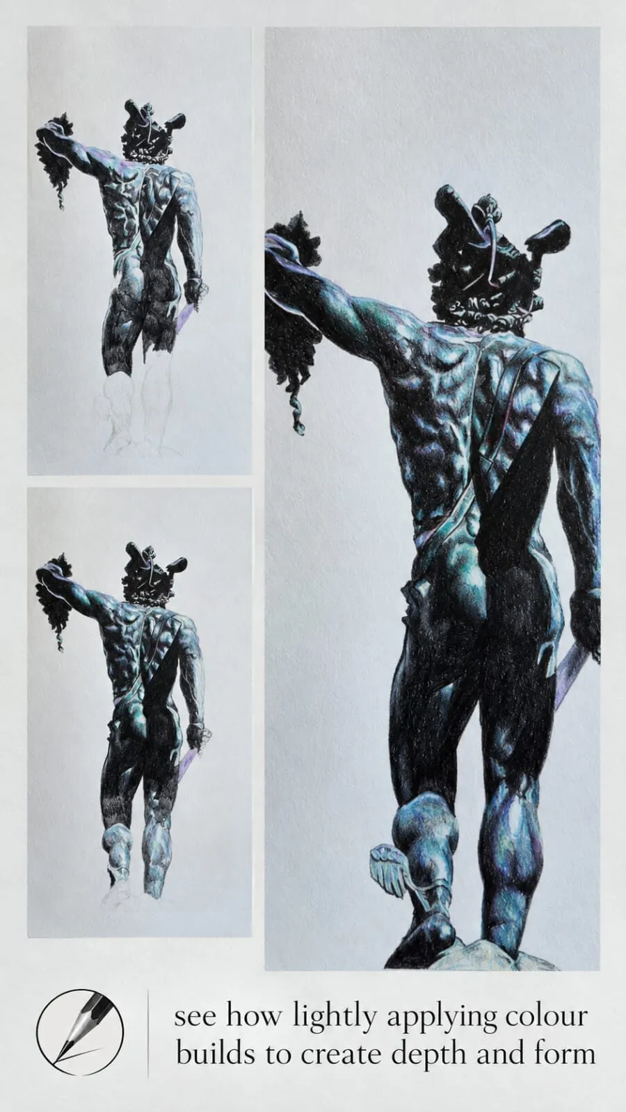
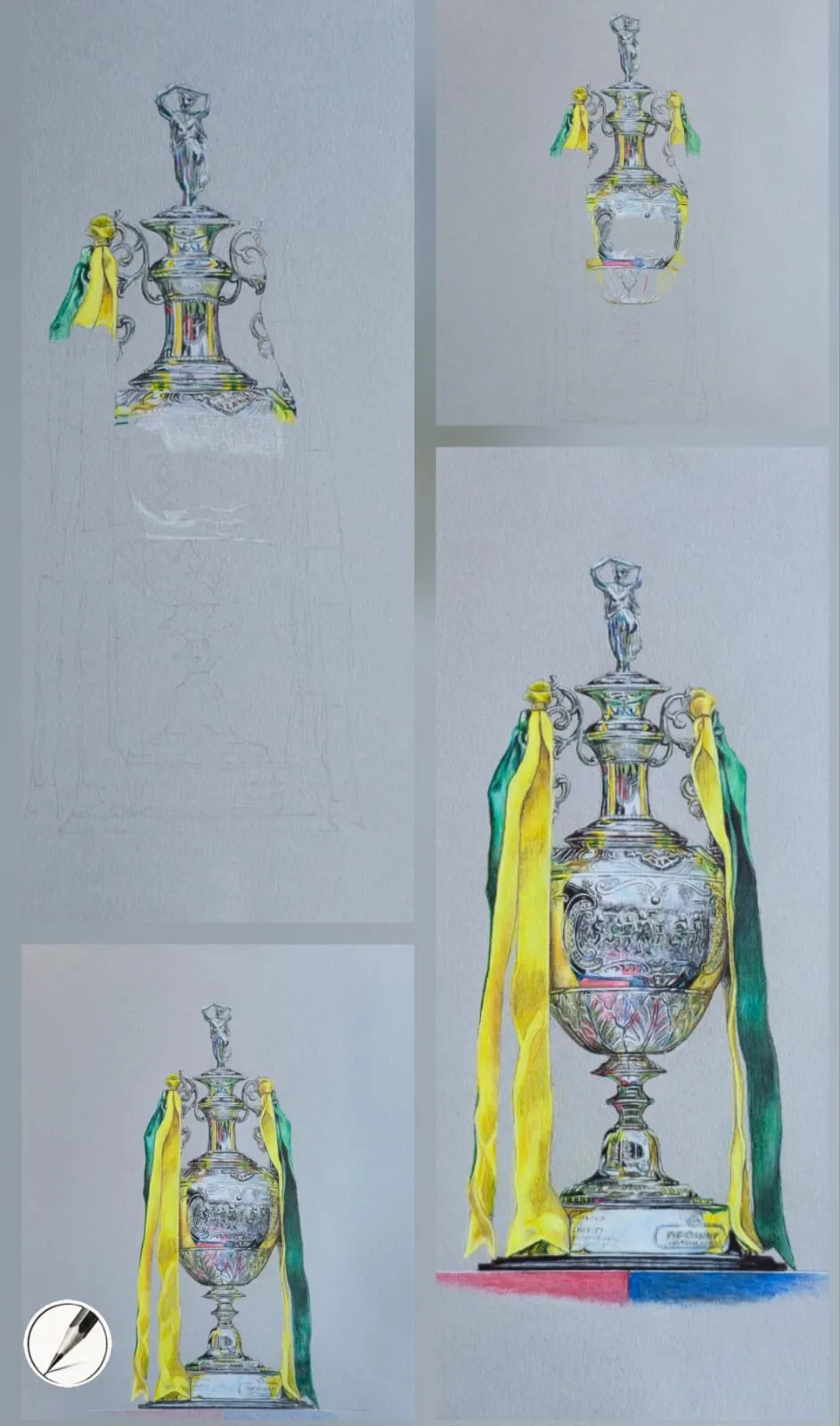
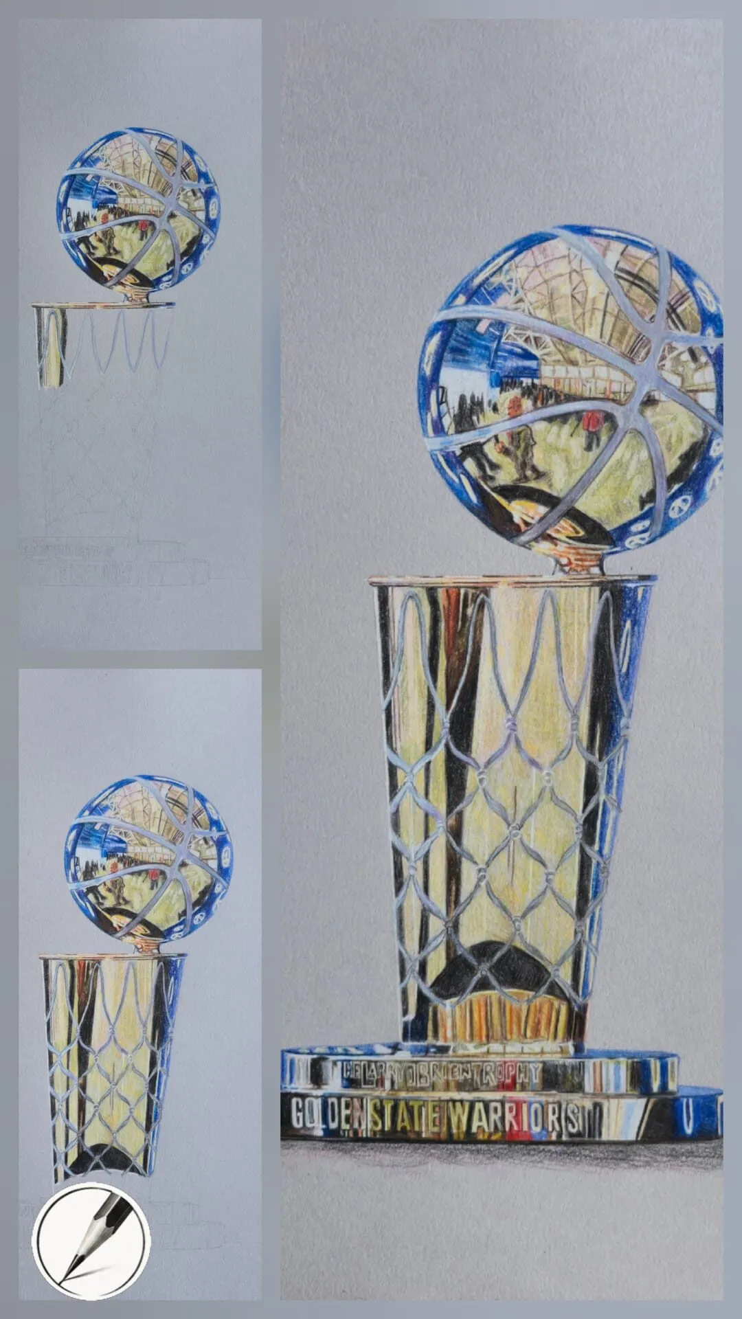
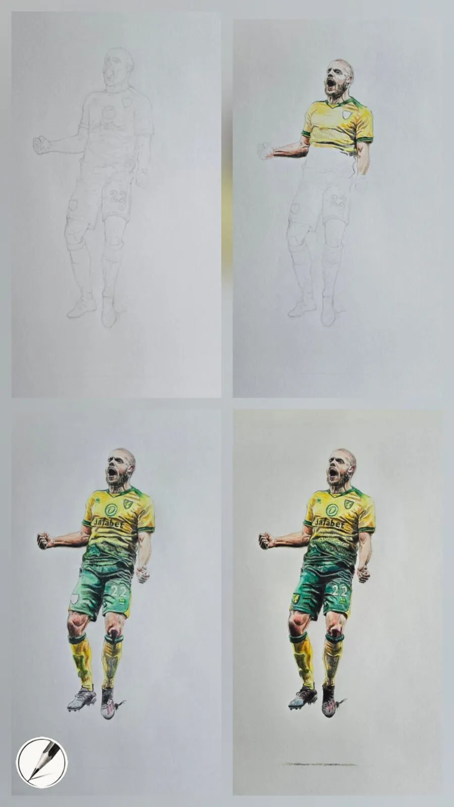
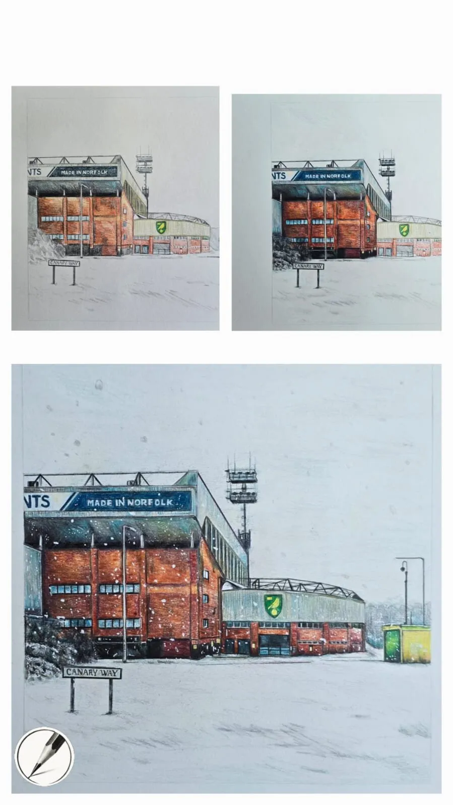
The four-stage figure below shows this in action: the drawing is worked from the top down, with colour and form building at every stage rather than being finished section by section.
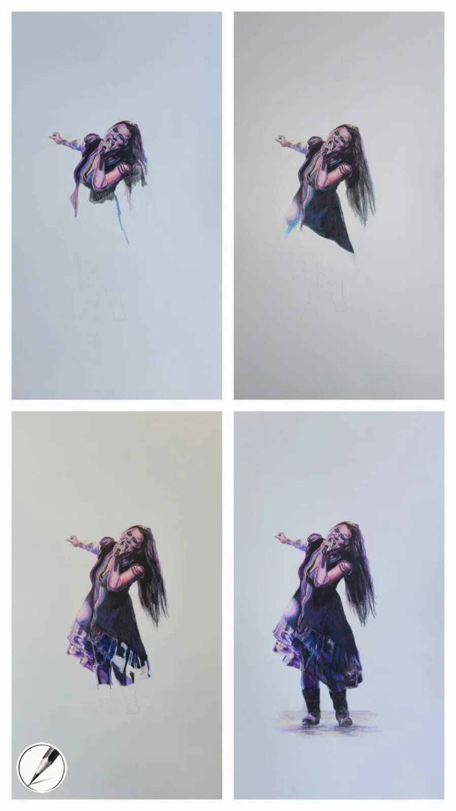
The same drawing across four stages. Each stage adds a little more colour and detail; nothing is finished early.
1. Plan values and lay out the drawing
Colour gets the attention, but value - how light or dark something is - does the structural work. A drawing with correct values and approximate colour still reads as convincing; correct colour with muddled values never does. Before you touch a coloured pencil, decide where your lightest lights and darkest darks will fall.
Our value study tool turns a reference photo into a simple tonal map, which is a fast way to see the pattern of light and shadow you are aiming for. Our guide to value in drawing explains how to judge and control it.
For the layout, keep lines light enough to disappear under colour. If your subject is complex, the grid drawing tool helps you transfer proportions accurately so you are not tempted to correct big errors with heavy pencil later. Getting the outline right at the start matters more than usual in coloured pencil, because heavy erasing damages the paper and limits how many layers it will take.
For a full walk-through of how these stages hang together on one piece, see how a realistic drawing comes together.
2. Layering: the foundation of everything
Layering is the technique every other technique sits on. The principle is simple: apply colour lightly, then apply more, then more again. Each layer is a whisper. Because light pressure leaves the paper’s tooth open, the surface can keep accepting pigment, and colours mix optically as one layer shows through the next.
The alternative - pressing hard early - fills the tooth and leaves you with a glossy, waxy surface that will not take more colour. That is the classic beginner problem, and it is also why many mid-career artists spend years refining their pressure control rather than learning new tricks.
A few habits make layering work:
- Keep points sharp and rotate the pencil as you work so the stroke stays even.
- Vary stroke direction between layers so the paper’s grain is covered from different angles.
- Build from light to dark, and from general colour to specific.
- Think in thin layers, and expect a finished area to hold many of them.
Our full guide, how to layer coloured pencils, gives a numbered method, pressure guidance and the mistakes to avoid.
3. Blending: smoothing without losing texture
Blending merges colours and softens transitions. It is what turns a patchwork of strokes into skin, sky or smooth icing. There are several ways to do it: using a lighter pencil over the top, using a colourless blender, burnishing, applying solvent, or simply adding more layers. Soft pencils blend easily; firm pencils blend more cleanly and hold detail. The right choice depends on the subject and the paper.
Blending is essential for skin, fur and atmospheric backgrounds, and it rewards patience: smoothness is built through layers, not force. Our comparison in how to blend coloured pencils sets out each method side by side and when to reach for it.
4. Colour mixing and matching
No object is a single colour. Skin is not peach; it is layers of ochre, rose, grey and brown. A red apple contains oranges, purples, greens and even blues from its surroundings. Matching colour therefore means seeing undertones and building colour by mixing, rather than hunting for the one pencil that looks right.
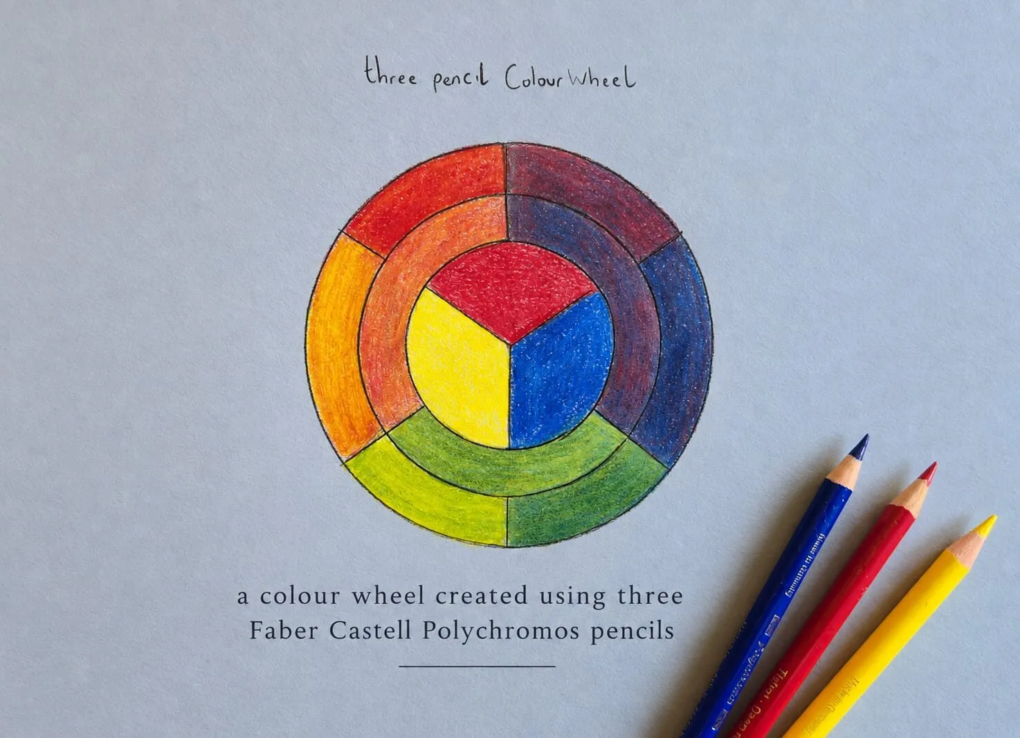
The practical method is to swatch, layer and compare: make small test patches on scrap paper of the same type, layer two or three pencils, and hold them against your reference. How to match and mix colours with pencils walks through this, including a hand-drawn swatch card that shows how layered pairs make colours look brighter on grey paper. The colour scheme generator is a useful companion for planning harmonious palettes, and the colour theory cluster explains the ideas underneath.
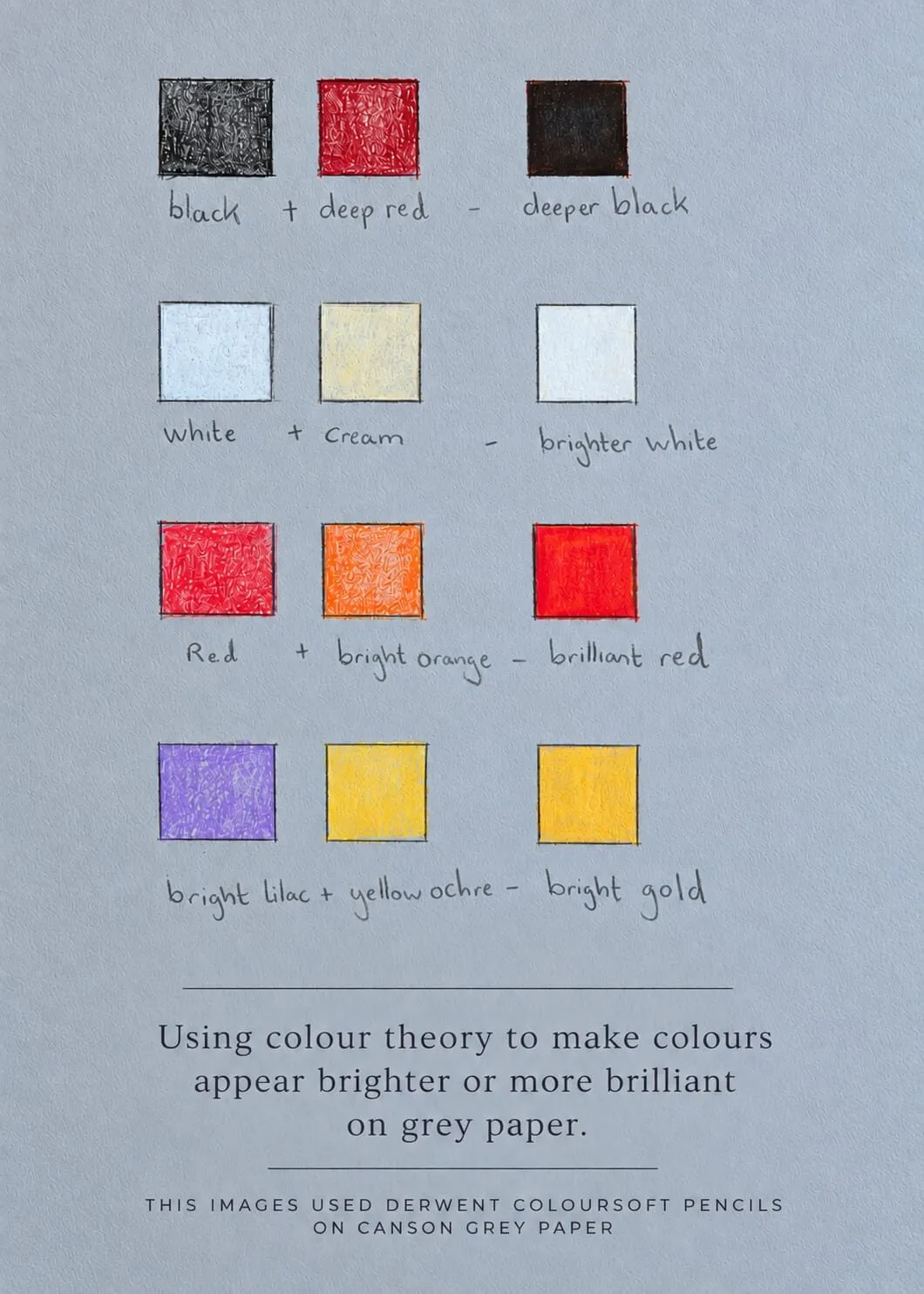
A hand-drawn swatch card on grey paper: layering colours in pairs to deepen blacks or brighten reds and golds.
5. Underpainting: structure before skin
An underpainting is a first, muted pass that establishes shadows and colour temperature before the final colour goes on. Greys, blues and ochres are common choices. Michael compares it to building the skeleton before adding the skin: it gives the drawing structure, direction and atmosphere, and it is especially valuable in portraits and still life.
Two approaches are widely used. A grisaille underpainting is a monochrome value study, usually in greys or a single hue. A complementary underpainting uses a colour opposite to the final one - a cool blue-green under warm skin, for example - so the finished colour has extra vibrancy. See underpainting in coloured pencil for the step-by-step method.
6. Deepening and refining
Once base colour is down, you deepen. Shadows get darker and richer, saturation rises where it should, and cast shadows tie objects to the surface they sit on. This is the stage where many drawings go wrong, because the temptation is to switch to heavy pressure and darken quickly. Keep layering, and make your darks from colour rather than a single black pencil where you can. Dark, layered colour looks alive; flat black looks like a hole.
Refining means moving from general to specific: crisp edges where the subject is sharp, soft edges where it turns away, small accents of colour, and careful value corrections. It is also where subject-specific technique matters most:
- Glossy surfaces need restraint and a small number of hard highlights - see how to draw glossy surfaces.
- Metal needs abrupt value changes and reflected colour - see how to draw shiny metal and reflections.
- Faces need gentle transitions and accurate proportion - see how to draw portraits in coloured pencil.
- Fur needs directional strokes and layered warmth - see how to draw animal fur.
7. Burnishing: the final polish
Burnishing means pressing hard with a light pencil, or a colourless blender, to crush the pigment into the paper. It flattens the tooth, smooths the surface and locks the colour in place. That is why it comes late: once burnished, an area will not accept much more colour.
It works beautifully on smooth, creamy papers such as Stonehenge and Arches Hot Press, where it produces an almost oil-paint depth. On textured papers such as Canson it gives a bold, dramatic sheen. Not every area should be burnished: skin and fur usually look better with a little texture left. Our guide to how to burnish coloured pencils covers when to burn and when to hold back.
8. Solvents and lifting
Two more techniques sit at either end of the process. Solvents melt pigment to create a paint-like wash. They are useful for smooth backgrounds and soft transitions, especially on textured papers, but should be used sparingly, since too much can warp the paper or oversaturate the colour. Read using solvents with coloured pencils before you begin, including the safety notes.
Lifting removes pigment to create highlights or fix errors, using eraser pencils, a battery eraser, kneaded putty or precision erasers. Textured papers lift well; smooth papers lift more gently. It is essential for shine and sparkle, and it is a skill worth practising early. See lifting and erasing coloured pencil, and our guide to the best erasers for coloured pencils for tools.
How the techniques combine
Techniques are not stages you graduate from; they overlap. A single portrait might use all of them in different places:
| Area | Typical combination |
|---|---|
| Skin | Muted underpainting, many light layers, gentle blending, minimal burnishing |
| Fur | Layered directional strokes, light blending, lifting for individual hairs |
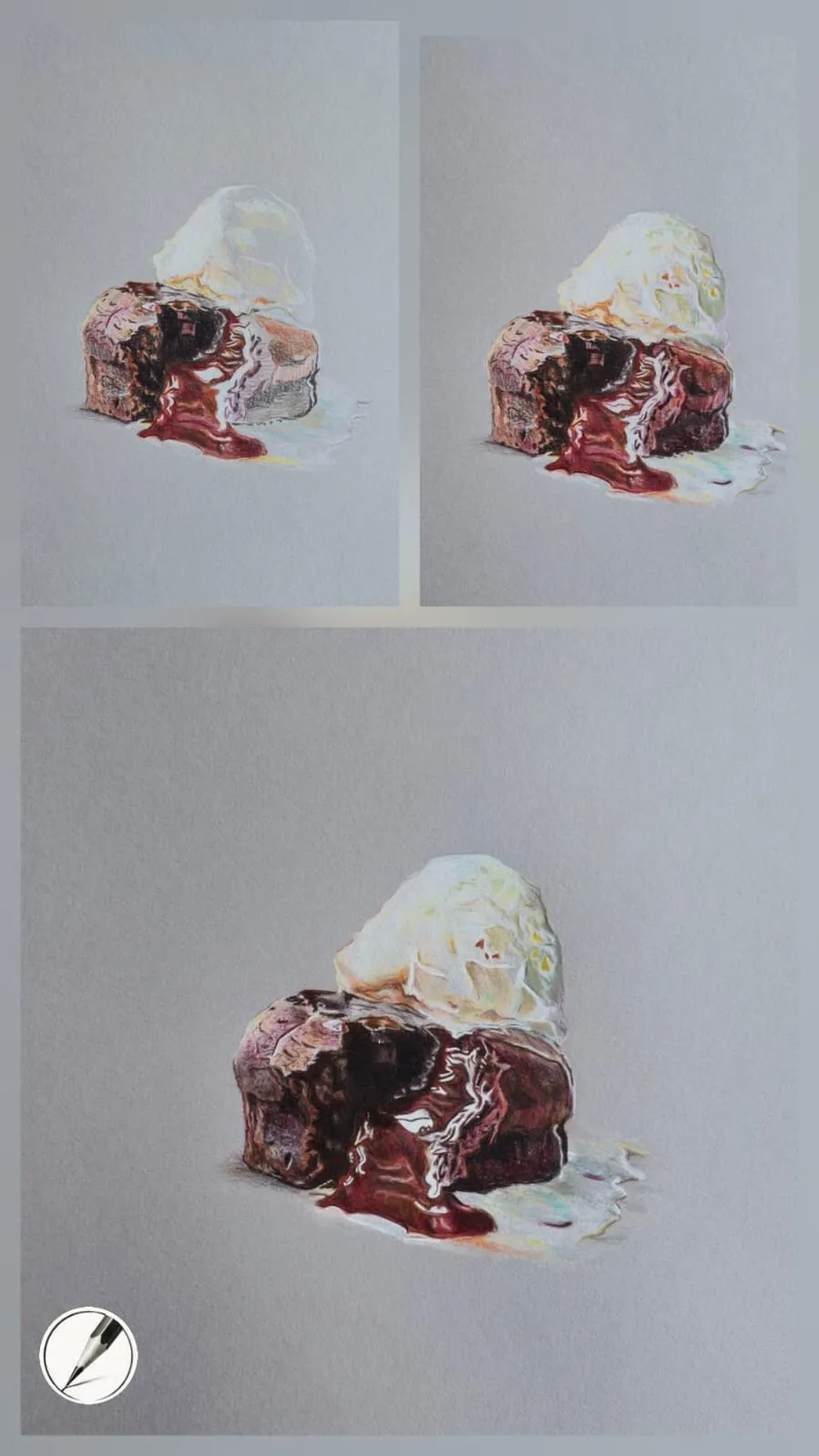
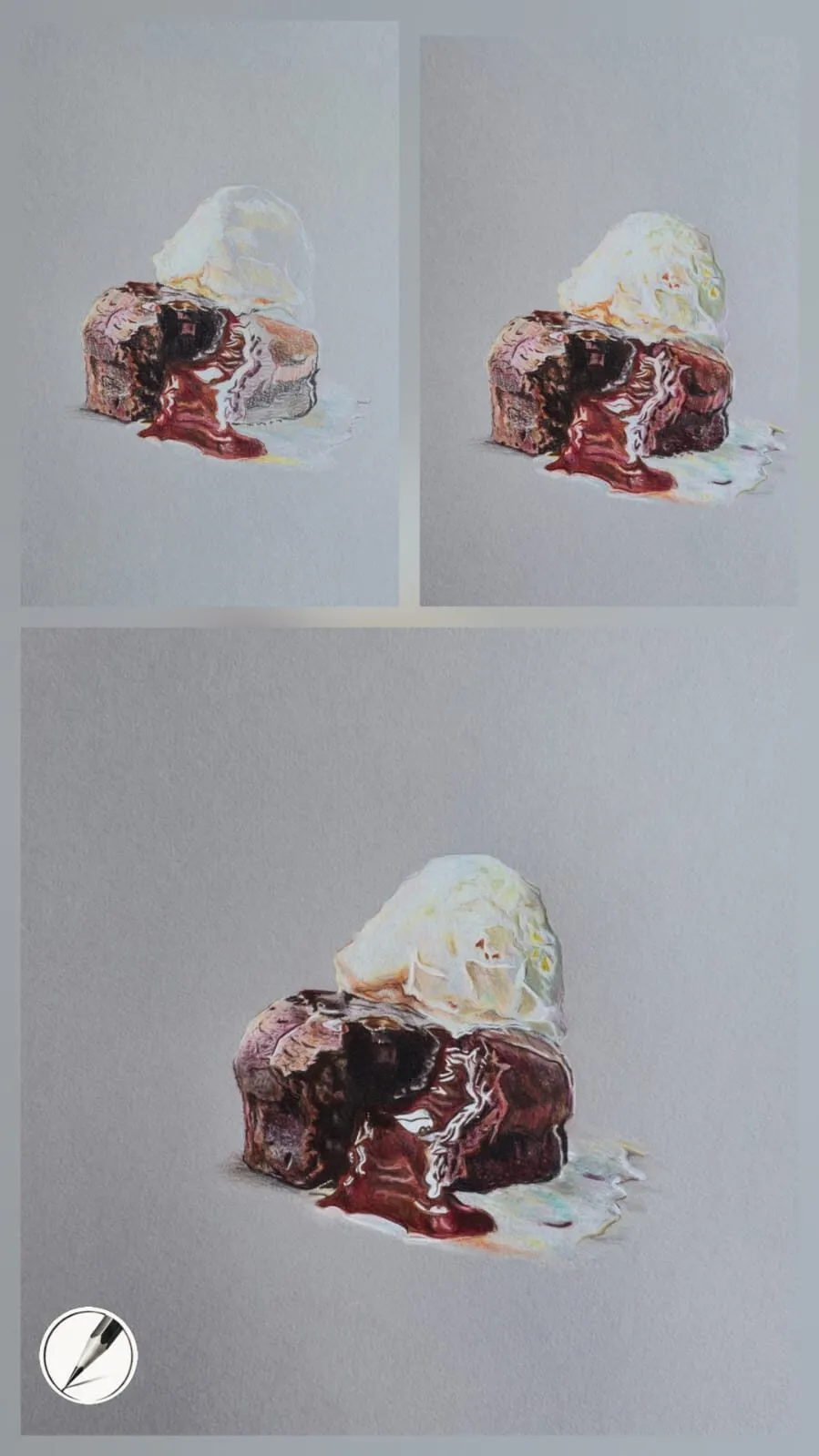
| Glossy icing | Smooth base layers, blending, burnishing, crisp lifted highlights |
| Metal | Layered high-contrast values, burnished edges, sharp white highlights |
| Soft background | Layers, then a colourless blender or a light solvent wash |
The rule underneath the table is to match the technique to the surface you are describing. Hard, shiny, smooth surfaces want smoothness and sharp contrast. Soft, organic surfaces want texture and gradual transitions.
The order to learn them
You can read about every technique in a weekend, but you cannot learn them all at once. This order builds skills in the sequence that each depends on the last:
- Layering and pressure control. Practise until you can make a smooth, even tone from light to dark with no waxy shine.
- Value planning. Draw simple studies in one colour so you can judge tone before adding colour.
- Blending. Learn each method on a small patch before using it in a drawing.
- Colour mixing. Build swatch cards and matching exercises.
- Lifting and erasing. Learn how your paper responds so you can correct without fear.
- Underpainting. Add a muted first pass to a familiar subject.
- Burnishing. Use it deliberately, on finished areas only.
- Solvents. Try last, on scrap paper first, with proper ventilation.
- Subject techniques. Glossy surfaces, metal, portraits and fur.
If you are new to drawing generally, drawing for beginners: where to start covers observation and proportion, which no technique can replace.
Equipment and paper notes
Technique is only part of the picture; equipment changes how each method behaves.
- Pencils. Wax-based pencils such as Derwent Coloursoft are soft and blend easily; oil-based pencils such as Faber-Castell Polychromos are firmer and hold a fine point for detail. See wax versus oil-based coloured pencils for how that affects layering, and our best coloured pencils roundup for what to buy.
- Paper. Heavier paper takes more layers without breaking down. Michael uses Arches Hot Press and Stonehenge White for smooth, seamless blending, and grey Canson Mixed Media for glossy subjects, where the strong grain lets pencils layer well and hold their colour. Our best paper for coloured pencils guide and smooth versus textured paper explain the trade-offs, and the paper pillar covers the rest.
- Sharpening and erasing. A sharp point is a technique in itself. See our guides to pencil sharpeners and erasers, and keep a battery eraser for precise lifting.
Common mistakes across every technique
A few more are worth naming:
- Skipping the value plan. Colour cannot rescue a drawing whose lights and darks are wrong.
- Finishing one area at a time. Bring the whole drawing up together so the relationships stay consistent.
- Over-erasing. Repeated heavy erasing damages the surface; plan carefully at the start.
- Adding highlights too early. Highlights only look bright when everything around them is darker.
- Ignoring the paper. A technique that works on hot press can fail on textured or lightweight paper.
Where to start
If you have an hour: read how to layer coloured pencils and do the pressure exercise in it. If you have a weekend: add blending and colour matching, and make your first swatch card. If you want the whole picture on one drawing, read how a realistic drawing comes together and follow one piece from layout to final highlight.
New to all this? Start with our coloured pencil drawing for beginners guide, then learn how to sharpen coloured pencils, compare the best blending tools for coloured pencil and browse coloured pencil drawing ideas. To practise these methods on real subjects, head to the how to draw hub. Coloured pencils are called colored pencils in the US, and everything in this guide applies to both.
New to all this? Start with our coloured pencil drawing for beginners guide, then learn how to sharpen coloured pencils, compare the best blending tools for coloured pencil and browse coloured pencil drawing ideas. To practise these methods on real subjects, head to the how to draw hub. Coloured pencils are called colored pencils in the US, and everything in this guide applies to both.
The short version
Plan your values, lay out lightly, build colour in thin layers, deepen gradually, refine, then burnish and lift only when the drawing is nearly done. Learn layering first, because everything else is built on it, and choose paper that lets each technique do its job.