
Colour theory has a reputation for being technical, and most of the diagrams do not help a person holding a pencil. But in practice it is simply a way of understanding how colours behave together, and how you can use those relationships to make a drawing feel richer, more intentional and more alive.
This guide is the map for the whole cluster. It explains the five ideas that matter for pencil work, shows how they combine on the page, gives you exercises to try, and points to a dedicated guide for each topic. If you only read one section, read the “where to start” path near the end. Everything here applies to coloured pencils, called colored pencils in the US. Pull a palette from any reference with the palette from photo tool, and if you are new, see coloured pencil drawing for beginners and the pencil set quiz.
The short version: five things to notice
Every colour you put down can be described in five ways. Once you can see them separately, you can change one without accidentally changing the others.
| Property | The question it answers | What you control with pencils |
|---|---|---|
| Hue | Which colour is it? | Choice of pencil, and mixes of layers |
| Value | How light or dark is it? | Pressure, number of layers, choice of pencil |
| Temperature | Does it lean warm or cool? | Undertones and neighbouring colours |
| Saturation | How intense or muted is it? | Layering, pressure, greys and complements |
| Harmony | Do the colours relate? | The overall palette you choose |
Colour theory is not about memorising formulas. It is about understanding why certain colour choices work, so you can use them on purpose.
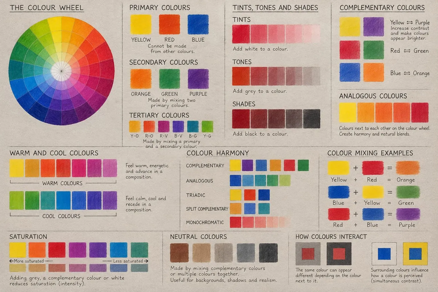
A hand-lettered colour theory chart showing the colour wheel, primary, secondary and tertiary colours, tints, tones and shades, harmony schemes and mixing examples.
Hue: the colour wheel as a working tool
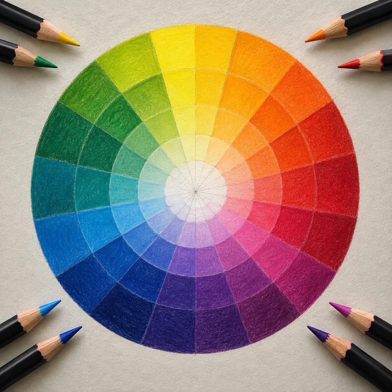
Hue is the name of a colour: red, yellow-green, blue-violet. The colour wheel organises hues into families and shows how they relate. Complementary colours sit opposite each other, analogous colours sit side by side, and triadic colours are spaced evenly around the wheel.
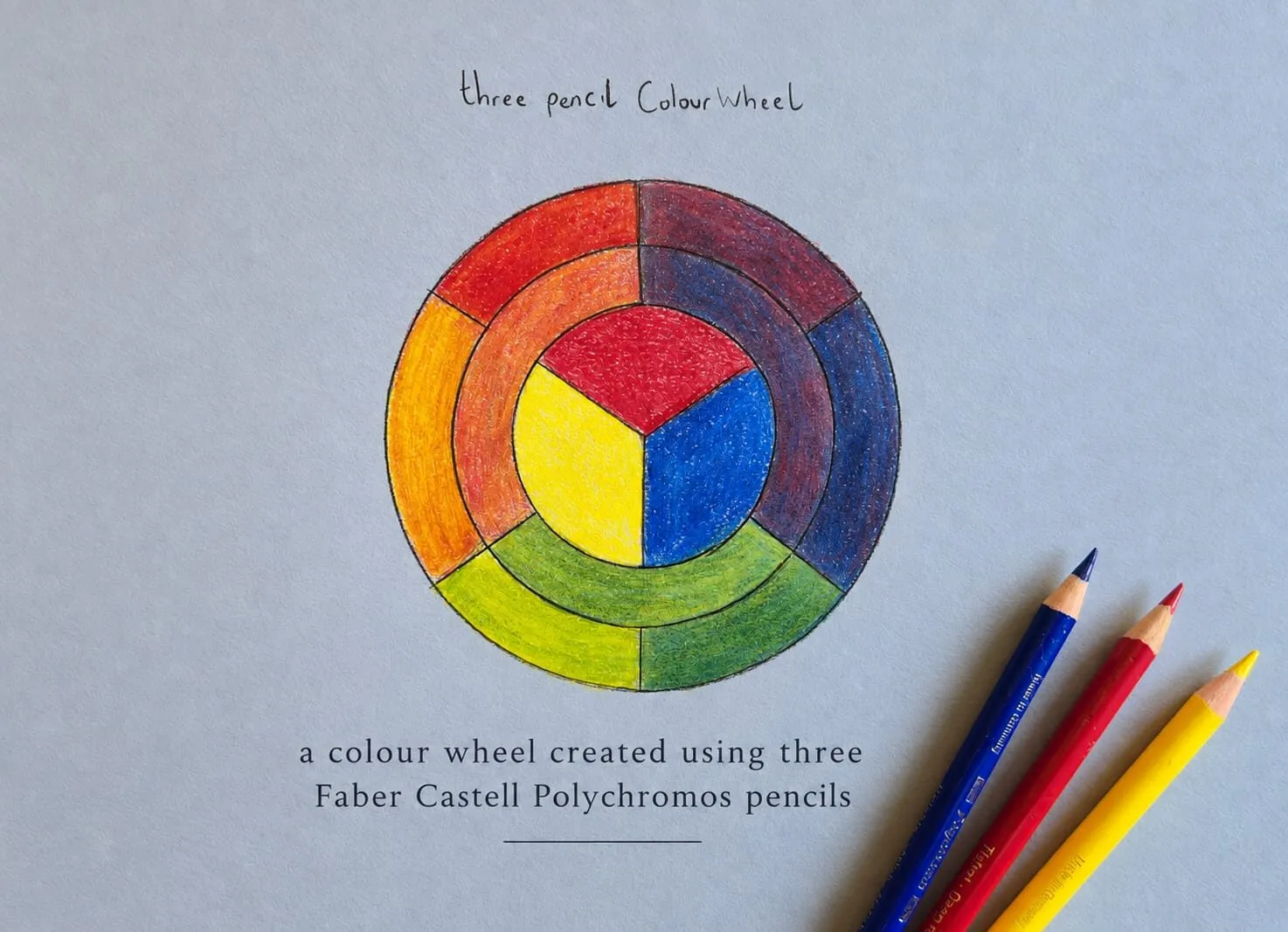
The most useful thing to do with a wheel is make one. Michael drew his by hand with just three Faber-Castell Polychromos pencils on blue-grey paper, and the point of the exercise is what it teaches you: how far three pencils will go, and what the mixed hues actually look like when pigment goes down in layers rather than on a screen.
As the image at the top of this page shows, every hue on his wheel comes from layering those three pencils.
There are two wheels you will meet. The traditional artist’s wheel uses red, yellow and blue as primaries. The digital RGB wheel uses red, green and blue light and is what your screen and most design software use. Pencil pigments follow the traditional model much more closely, though no pencil is a perfect primary. The full story, with a step-by-step method, is in the colour wheel explained, and the mixing side is covered in primary, secondary and tertiary colours.
Value: the part that does the heavy lifting
Value is how light or dark a colour is, and it matters even more than hue. A drawing with strong value contrast reads clearly even when the colours are simple. When the values are too similar, a drawing can look flat no matter how carefully it is rendered.
That is why experienced artists work in shapes first: light, mid-tone and dark. Squint at your reference and it collapses into those three groups. Get them right and colour has something solid to sit on.
To check your own work, convert a photo of it to greyscale, or run it through the value study tool, which reduces an image to a handful of tones. The method, including thumbnail value plans and the squint test, is in value in drawing.
Temperature: warm advances, cool recedes
Warm colours (reds, oranges, yellows) tend to feel closer and more energetic. Cool colours (blues, blue-greens, violets) recede and calm the eye. Shifting temperature within a drawing creates mood, depth and contrast without changing the subject.
Temperature also works inside a single colour family. A red can lean orange (warm) or lean crimson-violet (cool), and two “yellow” pencils can behave very differently when blended with the same blue. Learning to see these undertones helps enormously when you layer. Light and shadow usually carry opposite temperatures: warm light tends to produce cooler shadows, and cool light warmer ones. See colour temperature: warm and cool for exercises.
Saturation: intense versus muted
Saturation is how intense or muted a colour is. Highly saturated colours feel bold and immediate. Desaturated colours feel softer and more subtle, and they make the saturated colours around them look stronger by comparison.
In coloured pencil you control saturation with technique. More layers create richer colour. Lighter pressure, or mixing with greys and neutrals, softens it. A thin layer of a complement over a colour is the classic way to mute it without turning it to mud. Most beginners overuse saturation, and a drawing improves quickly once you save the strongest colours for the places you want the eye to land. Details are in saturation and muted colours.
Harmony: making colours relate
Harmony ties the other four together. A harmonious palette does not mean everything matches. It means the colours relate in a way that feels intentional.
- Complementary schemes create drama and vibration.
- Analogous schemes create calm and unity.
- Triadic schemes create balance with liveliness.
- Monochromatic schemes explore one hue across a wide value range.
These relationships are not rules, just helpful guides when choosing colours for a drawing. Two guides go deeper: complementary colours in drawing covers contrast and neutralising shadows, and colour harmony schemes compares all the schemes with drawing examples. The colour scheme generator will build a scheme from any starting colour, which is a fast way to test an idea before you commit pencil to paper.
How the five properties combine in practice
The properties are separate to think about, but they work together. A few realistic examples:
- A glowing highlight is a value decision (very light), a temperature decision (usually warm or slightly tinted rather than pure white) and a saturation decision (low chroma, so it reads as light and not colour).
- A shadow that feels alive is dark in value, cooler than the lit side, and slightly muted, often with a hint of the complement of the local colour.
- A focal point is usually the place where saturation, value contrast and temperature contrast all peak at once.
A useful working order is: value plan first, then temperature (which areas are warm, which cool), then hue, then saturation adjustments, then check harmony. When a drawing feels wrong, go back down the list in that order. Nine times out of ten the problem is value.
Colour theory on grey paper
Toned paper changes how every colour reads. Michael’s swatch card, made with Derwent Coloursoft on Canson grey paper, shows four pairings that look brighter or deeper than either pencil alone: black over deep red for a deeper black, white over cream for a brighter white, red over bright orange for a brilliant red, and bright lilac with yellow ochre for a bright gold.
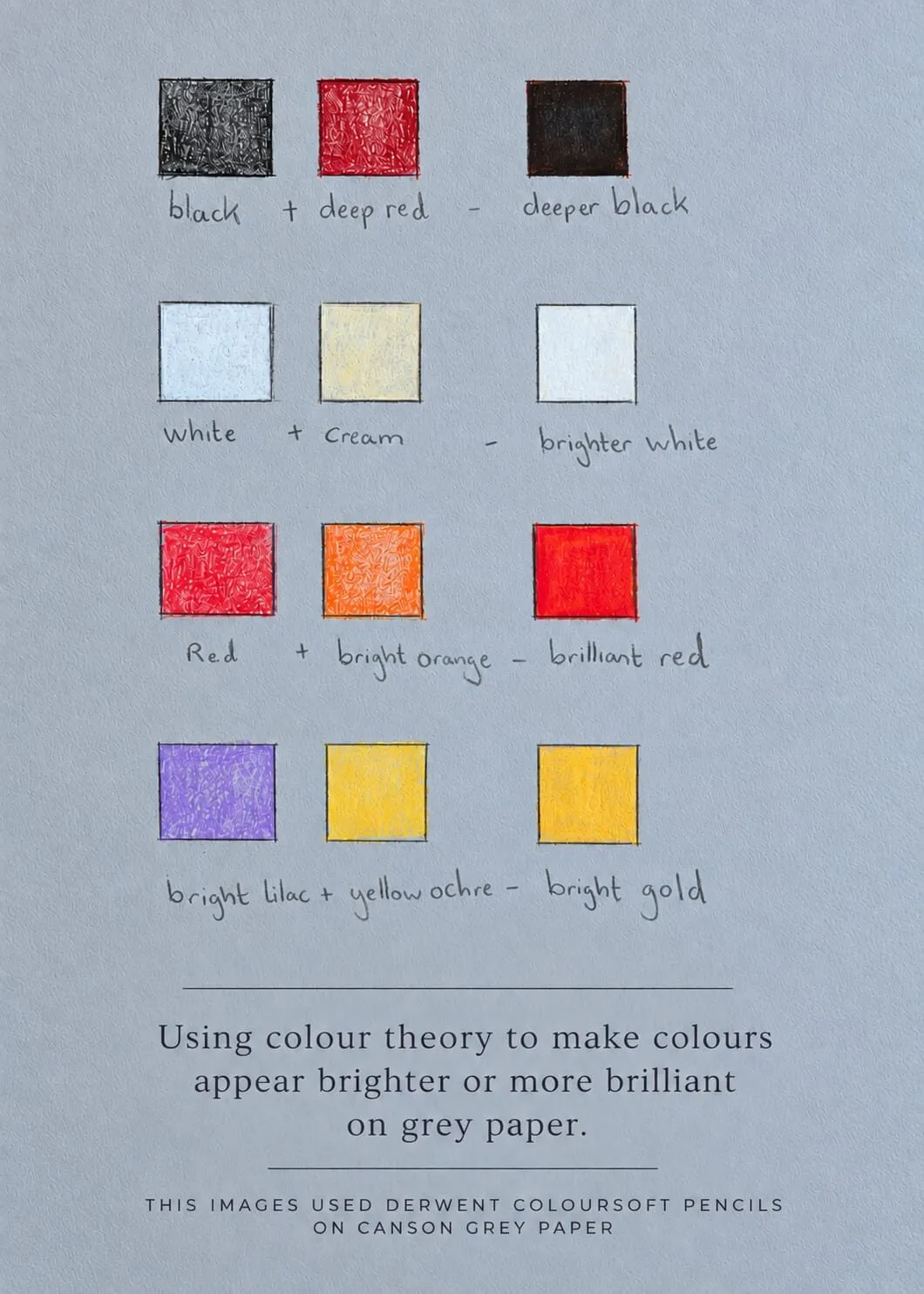
The swatch card: “Using colour theory to make colours appear brighter or more brilliant on grey paper.”
The reasoning is in colour theory on grey paper, and it pairs with the paper article why use grey paper for coloured pencil.
Practical applications: palettes and skin
Two applications bring the theory together.
Limited palettes. Working with three to six pencils forces you to understand mixing, and it produces naturally harmonious results. Limited palette drawing shows how to choose a small set and mix greys from it.
Skin tones. Skin is not peach. It is layers of ochre, rose, grey and brown, and the range across different skin tones comes from varying the proportions and depth of those layers. How to mix skin tones with coloured pencils walks through it. It also connects to how to draw portraits in coloured pencil.
Exercises that teach the theory
Ten to twenty minutes on any of these will do more than an hour of reading.
- Three-pencil wheel. Pick three pencils and make a twelve-step wheel by layering. Note where the mixes fall short. That is your set’s real gamut.
- Value strip. Draw a nine-box strip and fill it from lightest to darkest with a single pencil, using pressure and layers. Check it in greyscale.
- Complement swatches. Lay one colour, then a complement over it at increasing pressure, and watch it slide toward a neutral.
- Warm and cool pairs. Find two reds, two yellows and two blues in your set. Blend each pair and record the mixes.
- Thumbnail plan. Draw a 5 cm thumbnail of your next subject in three tones only, then add colour to it in a limited palette.
- Swatch card on toned paper. Test pairings on grey paper as Michael did, and keep the card next to your desk.
The colour scheme generator and the value study tool both support these exercises: use the first to pick a palette and the second to check the plan.
Where to start
If you are new to colour theory, work through the cluster in this order:
- The colour wheel explained to see how colours relate.
- Value in drawing, because it fixes the most problems fastest.
- Primary, secondary and tertiary colours to understand mixing.
- Complementary colours in drawing for contrast and shadows.
- Colour temperature and saturation for control.
- Colour harmony schemes to plan whole palettes.
- Limited palette drawing, colour theory on grey paper and skin tones as applications.
Every guide in this cluster
| Guide | Why click |
|---|---|
| The colour wheel explained | Make a wheel with three pencils and understand RYB versus RGB |
| Primary, secondary and tertiary colours | Choose a limited mixing set and learn why pencil primaries are never pure |
| Complementary colours in drawing | Neutralise shadows and add contrast |
| Colour harmony schemes | Compare six schemes with real drawings |
| Value in drawing | Fix flat drawings with value plans |
| Colour temperature | Create depth with warm and cool shifts |
| Saturation and muted colours | Control intensity and mood |
| Colour theory on grey paper | Make colours brighter on toned paper |
| Limited palette drawing | Draw with three to six pencils |
| Skin tones with coloured pencils | Build convincing skin in layers |
Related guides elsewhere on the site
Colour theory sits between technique and materials. The techniques cluster covers the hands-on side, in particular how to match and mix colours with pencils, how to layer coloured pencils and underpainting in coloured pencil. The coloured pencils cluster helps you choose a set with a good spread of hues and reliable undertones, and the paper cluster explains how surface and colour interact. For a steady practice routine, see how to practise drawing daily.
The takeaway
Colour theory is not a set of rules to obey. It is a vocabulary for what you already see: how light or dark, how warm or cool, how intense, how related. Learn the five words, make a wheel, make a swatch card, plan your values, and your palettes will get more confident with every drawing.