Colour Theory
Value in Drawing: Why It Matters More Than Colour
Value, how light or dark a colour is, does more work than hue. Learn value scales, the squint test, greyscale checks and thumbnail plans for pencil drawing.
Key takeaways
- ◆Value is how light or dark a colour is, and it matters even more than hue.
- ◆A drawing with strong value contrast reads clearly even when the colours are simple. Similar values look flat however carefully you render.
- ◆Work in three big shapes first: light, midtone and dark. Then add colour on top.
- ◆Check values with the squint test, a greyscale photo or the value study tool, and do it often.
- ◆Plan values in a small thumbnail before you start, and keep the extremes for where you want the eye to land.
If a drawing looks flat, the first instinct is to blame the colours. The real culprit is usually value: how light or dark each area is. Value matters even more than hue. A drawing with strong value contrast will read clearly even if the colours themselves are simple, and when values are too similar a drawing can look flat no matter how carefully it is rendered.
This guide shows how to see value, how to plan it, and how to test it with your eyes and with the value study tool. It is the second most important page in the colour theory cluster, after the wheel, and the one that fixes the most drawings. Value matters in coloured pencil (colored pencil in the US) and graphite alike. Practise it with how to draw basic forms and shading and how to draw shadows and light.
What value is, and why it does the heavy lifting
Value is lightness. Every colour has one. A pale yellow is high in value, a deep violet is low, and a mid green sits between. Value is separate from hue: two completely different colours can share the same value, and when they do, the eye struggles to tell where one ends and the other begins.
That is why value carries form. Light falling on a sphere produces a gradient from light to dark, and that gradient, not the colour, is what tells you it is round. Take away the value and no amount of colour rescues the form.
There are practical consequences:
- Readability. A drawing with a clear range of light and dark reads at a distance, and a drawing without one dissolves.
- Focus. The eye goes to the strongest value contrast, so put your highest contrast where the viewer should look.
- Freedom with colour. Because value carries the structure, you can be inventive with hue. Many striking drawings use strange colours but honest values.
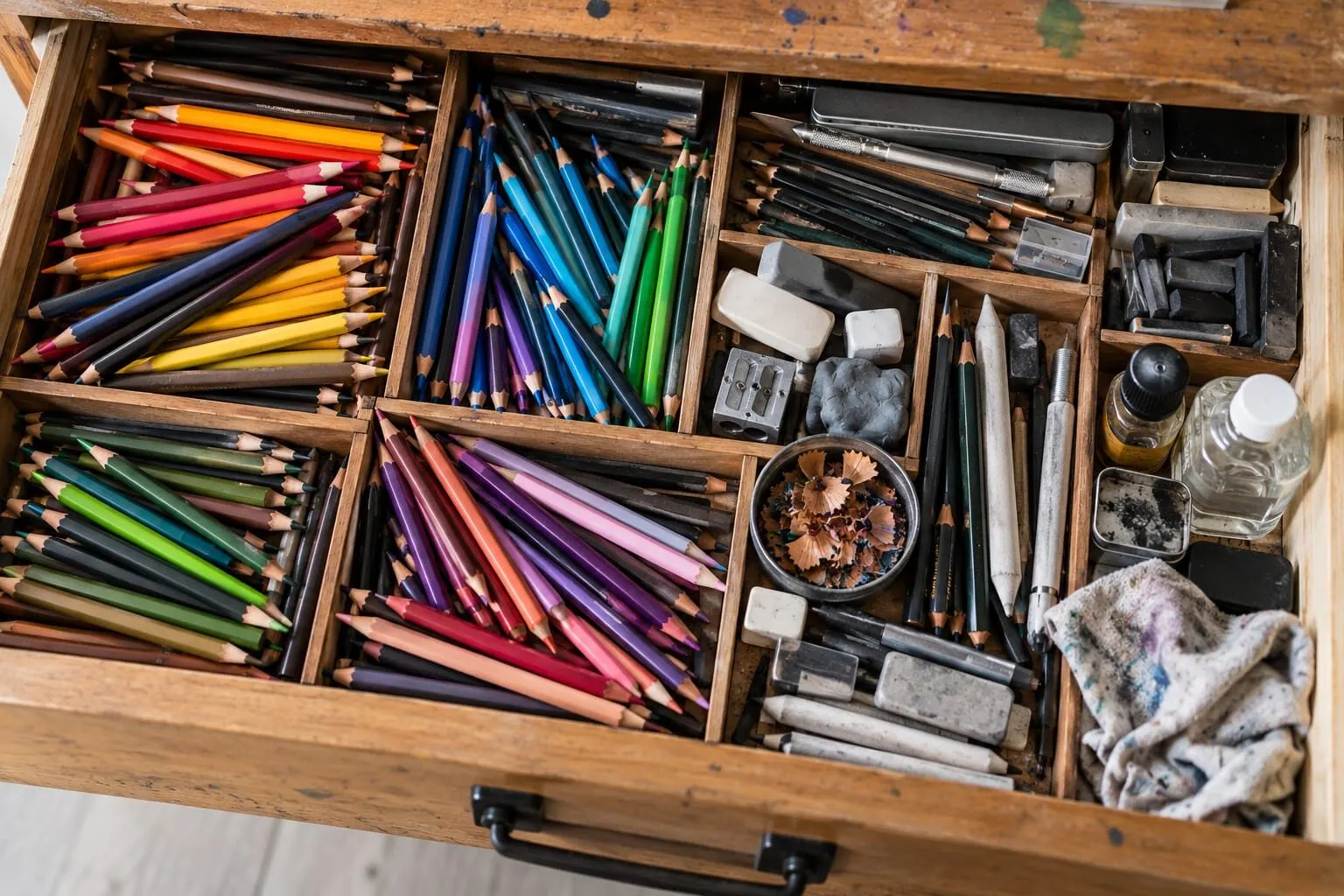
A wooden drawer of coloured pencils, erasers, brushes and art supplies in separate compartments.
Light, midtone and dark: the three-shape method
Focusing on light, midtone and dark shapes first gives you a solid structure to build colour on top of. The method is straightforward.
- Squint at your reference until fine detail disappears.
- Find the darkest shapes and the lightest shapes. Everything else is a midtone.
- Simplify the scene into those three groups, connecting shapes of the same value into single masses.
- Place them lightly in your drawing, with the rest of the detail waiting.
- Add colour within each group, keeping the value of each shape as you go.
This is the same logic as building a drawing from layout to detail, as shown in how a realistic drawing comes together.
Value scales: practice you can do in ten minutes
A value scale is a strip of boxes running from white to the darkest tone you can make. It teaches you what your pencils can do.
- Draw a row of nine boxes, each about 2 cm square.
- Leave the first box as white paper.
- Fill the last with your darkest possible tone, using several layers and firm pressure.
- Fill the boxes between in even steps. The middle one should be the true midtone.
- Repeat with a coloured pencil, then with a second colour.
You will notice that some pencils cannot reach a deep dark on their own. That is useful knowledge. A pale yellow will never go as dark as an indigo, and it may need a darker partner in the shadows. Pencil pressure, the number of layers and the paper all change the range, so test on the paper you draw on. The graphite equivalent is explained in graphite pencil grades explained.
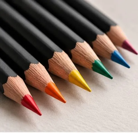
Sharpened coloured pencils lined up on cream paper.
Three ways to check your values
1. The squint test
Squint at your drawing and your reference. Detail and colour fade and value shapes remain. If a shape that should be dark looks the same as its neighbour, the value is wrong.
2. Greyscale
Take a photo of your drawing and turn it to black and white. Any area where two neighbours merge into the same grey is a value problem. Some artists also glance at their work in a mirror or turn it upside down, because a fresh view exposes imbalance.
3. The value study tool
Upload a reference to the value study tool and it reduces the image to a handful of tones. That reveals the true value structure of your subject before you draw a line, and it is ideal for thumbnails. Then photograph your drawing partway through and compare.
Thumbnail value plans
A thumbnail is a tiny drawing, about the size of a postcard or smaller, in three or four tones. It costs five minutes and prevents hours of rework.
- Draw a small frame with the same proportions as your paper. A grid drawing tool can help you keep the proportions when you scale up.
- Block in the main shapes as simple flat areas.
- Fill them with light, mid and dark. Do not add detail.
- Move the darkest dark and the brightest light to the place where you want the eye to rest.
- Look at the thumbnail from across the room. If it reads, the drawing will too.
Value in coloured drawings
Colour and value interact in ways worth knowing.
- Yellows are naturally high value, and blues and violets low. If your subject demands a dark yellow, it will look like a brown or olive. Do not fight it.
- Saturation and value are not the same. A pale saturated colour and a deep saturated colour both exist. Value tells you light or dark, and saturation tells you intense or muted. Keep them separate in your head. See saturation and muted colours.
- Temperature shifts help value. A warm light with a cool shadow can widen the range, as covered in colour temperature: warm and cool.
Common mistakes
- Working in colour first. Colour tempts you to chase hue and ignore value. Plan the values first.
- Timid darks. Beginners often stop at a mid-dark. Push your darkest darks further, but place them with care.
- Everything at the same level of contrast. If every edge is sharp and every area strong, nothing leads. Save your strongest contrast for the focal point.
- Trusting your eye alone. Bright colours fool the eye. Check with greyscale.
- Highlights too early. Add the brightest highlights last, once the darks are settled.
Exercises
- A nine-step strip in one pencil.
- One subject, three tones. Draw a simple object such as an apple in light, mid and dark only.
- Two colours, same value. Pick a red and a green of equal value, place them side by side and squint. They merge. Then darken one and watch the edge appear.
- Greyscale audit. Photograph a finished drawing, convert to greyscale, and note where it loses clarity.
Value and edges
Value changes are not only about what is light and what is dark, but also about how quickly one becomes the other. A hard edge is an abrupt value change, and a soft edge is a gradual one. Mixing them gives a drawing its sense of focus.
- Hard edges draw the eye and suggest something close, sharp or metallic.
- Soft edges suggest roundness, distance or a turning form.
- Lost edges, where two neighbouring values are nearly the same, let the eye complete the shape, which makes a drawing feel natural rather than outlined.
A practical habit is to decide the hardest edge in your drawing, at the focal point, and soften most of the others. It links directly to how you place your highest contrast. If you find you have hard edges everywhere, squint and ask which two or three actually matter, then let the rest melt into their surroundings.
The short version
Plan light, midtone and dark before colour, check with the squint test, greyscale and the value study tool, and save your strongest contrasts for the focal point. Once the value structure is right, colour choices become far more forgiving. Return to the colour theory hub for the next step, or read the colour wheel guide for the other half of the picture.
Quick answers
Frequently asked questions
What is value in drawing?+
Value is how light or dark something is, regardless of its colour. A pale yellow and a dark blue sit at opposite ends of the value scale even though they are different hues. Every colour has a value, and value is what gives a drawing its form and its readability.
Why does value matter more than colour?+
Because the eye reads shape and depth through light and dark before it registers hue. A drawing with strong value contrast reads clearly even with simple colours, while a drawing with similar values looks flat however carefully the colours were chosen. Getting value right gives colour a structure to sit on.
How do I check the values in my drawing?+
Squint at it, which blurs detail and exaggerates the big light and dark shapes. Or take a photograph and view it in greyscale. The value study tool on this site reduces an image to a few tones, which makes flat areas obvious immediately.
How many values should I use in a drawing?+
Start with three: light, mid and dark. That is enough for a strong structure. You can then divide each into two or three steps, giving a five to nine step scale. More is rarely needed, and fewer, well-placed values often read more strongly.