Drawing Techniques
How to Draw Portraits in Coloured Pencil
Portraits demand soft transitions and natural skin tones. A coloured pencil (colored pencil) method covering proportion, value, underpainting and skin.
This guide contains affiliate links. If you buy through them we may earn a small commission at no cost to you. How this works.
Jump to recommended products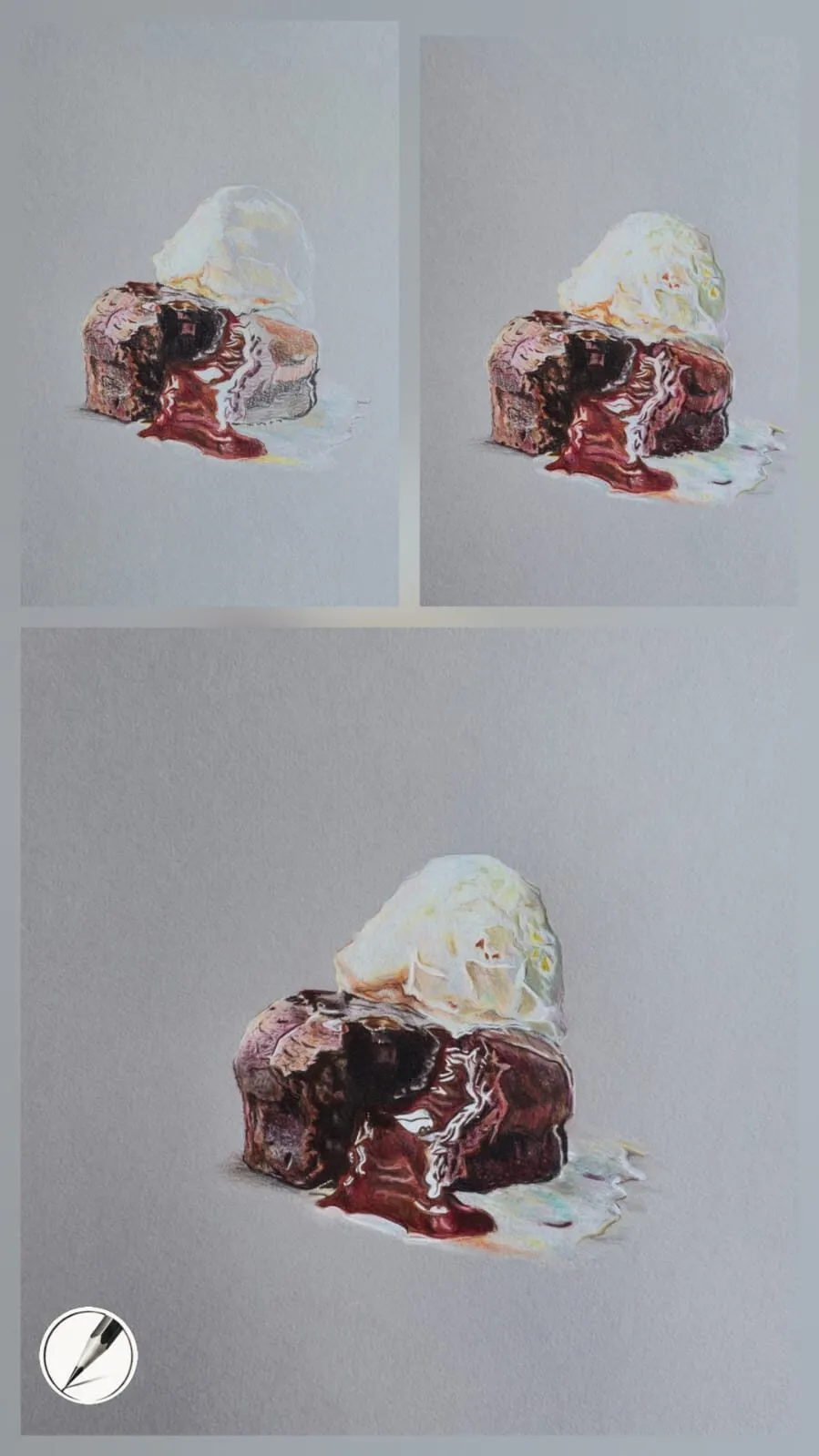
Key takeaways
- ◆Portraits demand subtlety: soft transitions, natural skin tones and smooth blending rather than bold marks.
- ◆Skin is not peach. It is layers of ochre, rose, grey and brown built up gradually.
- ◆Get proportion and value right before you worry about colour or detail.
- ◆Creamy pencils such as Luminance and Lightfast suit skin, and firm Polychromos suit eyes, hair and crisp detail.
- ◆Smooth papers such as Arches Hot Press and Stonehenge allow seamless blending, but they are harder to correct.
A portrait is unforgiving in a way that most subjects are not. A bowl of fruit can be a little wrong and still look like a bowl of fruit. A face that is a little wrong looks like someone else, or looks unwell. Coloured pencil makes that harder, because you cannot scrub out and repaint. It also rewards patience like no other medium, because slow, gentle layers are exactly what skin needs.
This guide gives a method you can follow from first line to final detail: proportion, value, underpainting, layered skin, then the features. It also covers pencils, paper and the mistakes that most often sink a portrait. For the wider colour story, our guide to mixing skin tones with coloured pencils is the natural companion.
What portraits ask of you
Michael’s guides sum it up in a line: portraits demand subtlety, with soft transitions, natural skin tones and smooth blending. That has practical consequences.
- Soft transitions. Forms in a face turn gently. Harsh lines around the cheek or jaw make a face look cut out.
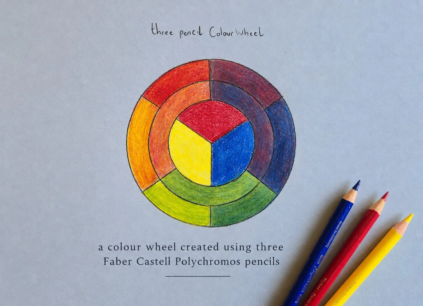
- Natural skin tones. No single pencil matches skin. It is a stack of layers.
- Smooth blending. Visible strokes and grain read as texture, so they belong in hair and clothing, not on a cheek.
Everything else in this guide serves those three things.
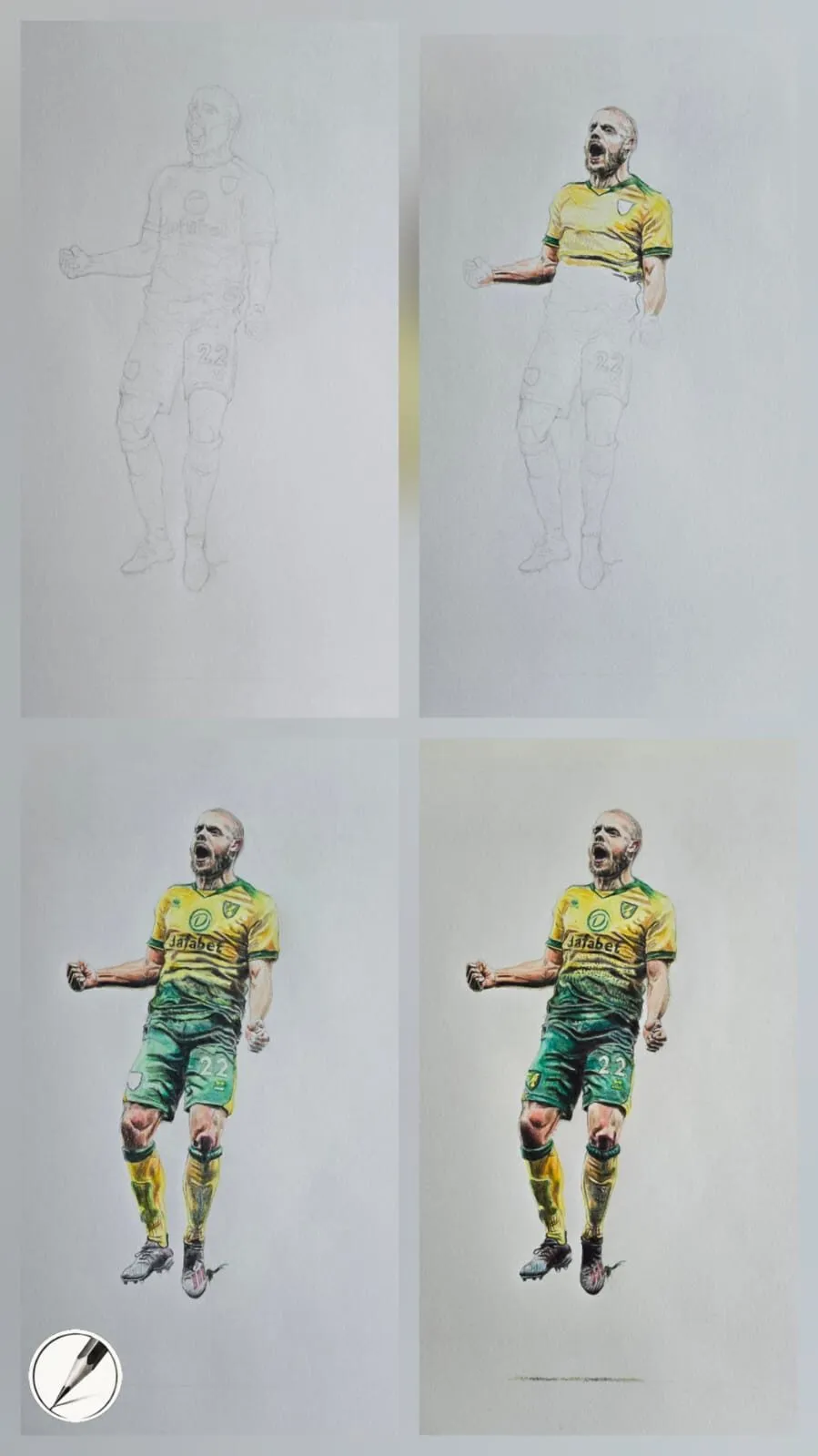
A footballer drawing shown from pencil layout to completed colour in four stages. Drawing by Michael Brace.
Pencils for portraits
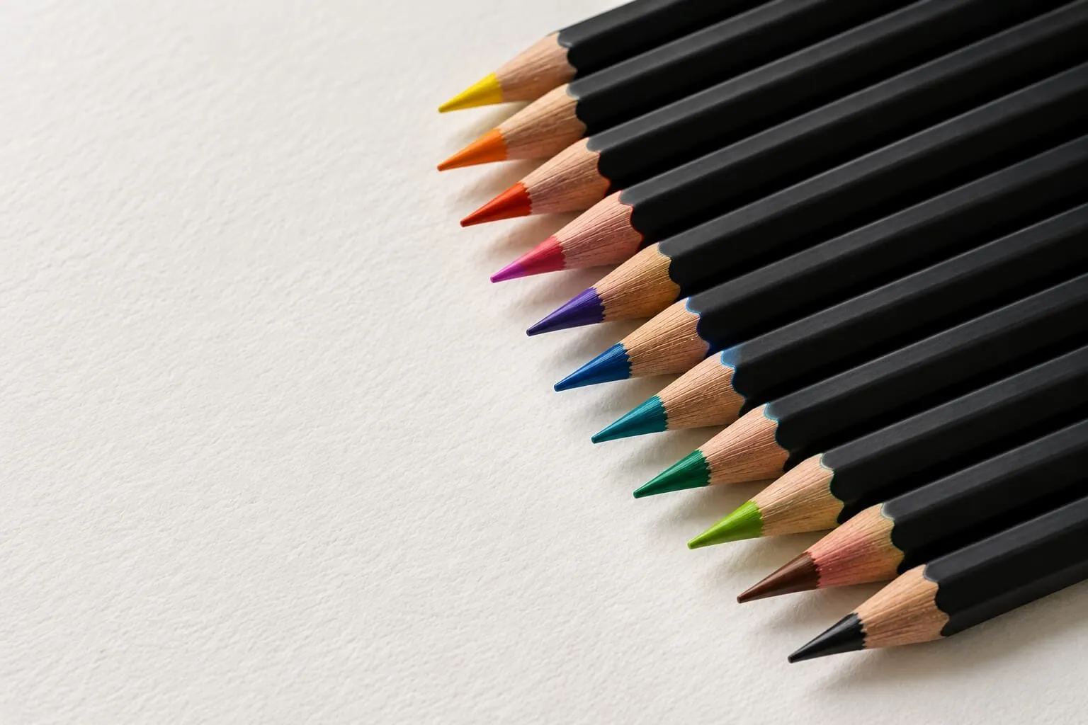
The best portrait pencils are creamy, opaque and capable of gentle layering without visible strokes. Michael’s shortlist is consistent:
- Caran d’Ache Luminance: soft and creamy, superb for skin tones, soft gradients and delicate transitions.
- Derwent Lightfast: rich, blendable, excellent for shadows, undertones and subtle colour shifts.
- Faber-Castell Polychromos: oil-based and firm, ideal for crisp detail around eyes, hair and texture.
The soft and firm types complement each other. Wax-based pencils give the smooth, painterly transitions of the face, and firmer oil-based pencils give the control needed for lashes, brows and the edge of a lip. Our full guide to the best coloured pencils for portraits compares them, and Polychromos versus Luminance versus Lightfast puts the three side by side.
A sharp point helps throughout, particularly around the eyes. Keep a good sharpener at hand and resharpen often.
Paper for portraits
Portrait work favours smooth, heavy paper that supports many layers without pilling.
- Arches Hot Press is buttery smooth and ideal for subtle gradients and fine detail. It is a favourite for clean transitions and soft skin tones.
- Stonehenge White is velvety and forgiving, perfect for soft realism and gentle transitions.
These are heavier papers, often in the 250 to 300 gsm range, which gives them the strength for multiple layers. The trade-off is correction: pigment sinks into smooth surfaces, so lifting is harder and accuracy at the start matters. Read lifting and erasing coloured pencil before you commit. For a full comparison of surfaces, see the best paper for realistic drawing and hot press versus cold press paper.
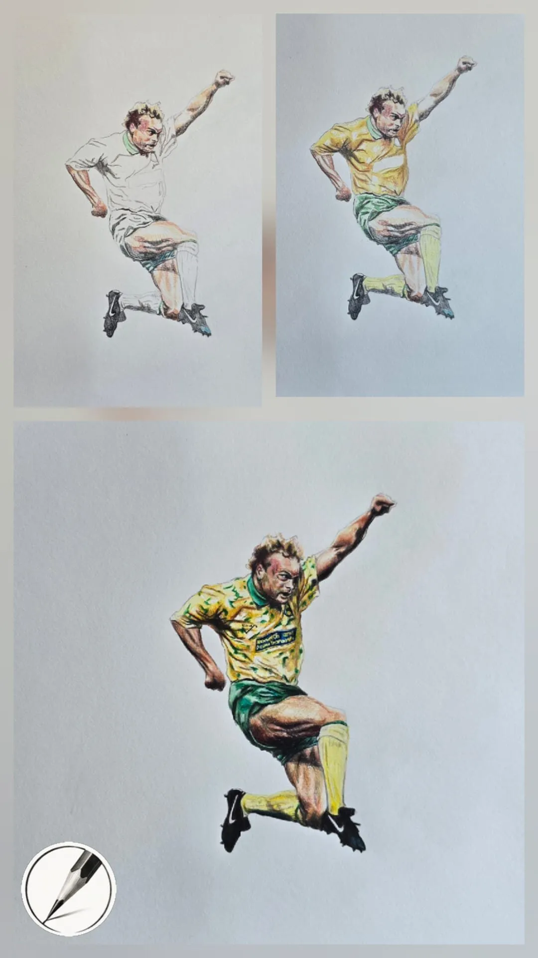
A leaping footballer drawn in coloured pencil, shown in three stages. Drawing by Michael Brace.
Step-by-step method
1. Proportion and layout
Everything depends on the initial drawing. Get the placement of the eyes, nose, mouth and the head shape right in a light outline before any colour goes down. A grid drawing tool is a reliable way to transfer proportions from a reference photo to your paper, and it takes the guesswork out of the most error-prone stage. Keep the lines very light, because they must not show through later.
Check your work against the reference by flipping both upside down or looking at them in a mirror. Errors that hide in the right-way-up view leap out immediately.
2. Value first
Before colour, decide where the lights and darks are. A face reads as three-dimensional because of value, not hue. Use the value study tool to convert your reference to greyscale and identify the main shadow shapes. Map those shapes lightly onto the drawing. If the values are right, the face will look solid even in a limited palette. If they are wrong, no amount of colour will rescue it. Our guide to value in drawing covers this in depth.
3. Underpainting
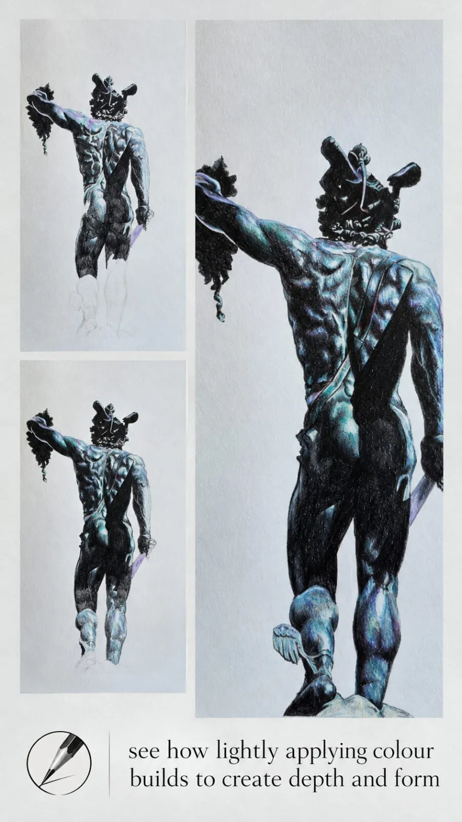
Underpainting sets the mood. Use muted colours such as greys, blues and ochres to establish shadows and temperature before adding the final colour. It gives structure, direction and atmosphere, the skeleton beneath the skin. Keep the layers light and the edges soft. For detail, see underpainting in coloured pencil.
4. Layering the skin
Skin is layers of ochre, rose, grey and brown. Build them in thin, even layers:
- Start with the lightest ochre or warm cream across the lit areas.
- Add rose where the blood is close to the surface: cheeks, nose tip, ears, lips.
- Add grey or a cool muted tone into the shadow areas to keep them from turning orange.
- Add brown for the deepest shadows under the chin, in the eye sockets and beside the nose.
- Move back and forth between the layers, adjusting warm and cool until the face feels alive.
Use light pressure and a sharp point, and keep the strokes overlapping and small. Pressing hard too soon flattens the tooth and limits later layers. If you need help mixing, how to match and mix colours with pencils explains how to see undertones, and how to blend coloured pencils covers smoothing.
5. Eyes, lips and hair
- Eyes. Draw them as forms, not symbols. The white of the eye is never pure white, and the iris sits partly under the upper lid, which casts a shadow. Add the darkest darks in the pupil and lash line, then place a small, crisp highlight last. Keep lashes light and few.
- Lips. Avoid outlining. Lips are soft changes of tone and colour, so build them with layers of rose, brown and a touch of the skin tone, and let the edges dissolve into the surrounding skin.
- Hair. Draw hair in masses first, then add strands. Work in the direction of growth, and use firmer pencils such as Polychromos for the fine, sharp lines. Our guide to drawing animal fur shares many of the same principles.
6. Refine and unify
Step back. Deepen the darks that have lost strength, soften any edge that looks too hard, and glaze a unifying tone over the whole face if it looks patchy. A light final burnish on hot press paper can smooth the transitions, but do it only when the layers are complete. See how to burnish coloured pencils.
Common mistakes
Portraits on toned paper
White or pale paper is the standard for portraits, but toned paper works too. Michael’s bearded head study and his old man head study use toned paper with white highlights to produce a dramatic, sculptural result. It is a different approach, since the paper supplies the mid-tone, but the fundamentals of proportion and value do not change.
Working with reference and lighting
Choose a reference with clear light. A photograph lit from one side gives strong, readable shadows, while flat, frontal light hides the form and makes a face harder to model. Look for a clear light source, a visible shadow side and a reasonably plain background. The lighting sets the whole mood of the portrait, from soft and gentle to dramatic.
Crop with care. A tighter crop puts more weight on the eyes and expression, and a looser crop gives space for clothing and setting. Whichever you choose, decide before you draw, because it affects the layout of the whole page. Once the drawing is under way, check it against the reference at regular intervals and step back to view it at a distance, where mistakes in proportion and value are easier to see.
Colour choices beyond skin
Portraits are not only skin. Clothing, backgrounds and hair all shape the finished picture. A muted, slightly darker background pushes a face forward, and a pale one keeps it gentle. Teal tones set off warm skin and hair, which is complementary colour at work. Our guide to complementary colours in drawing explains how to use that contrast deliberately.
Build your skills with lessons on face proportions, realistic eyes, lips and drawing a portrait from a photo, and plan skin tones with the palette from photo tool. Coloured pencils are called colored pencils in the US, and everything in this guide applies to both.
The short version
Start with accurate proportion, decide your values before you choose your colours, and build skin from thin layers of ochre, rose, grey and brown. Use creamy pencils for the face and firm ones for the details, and choose smooth paper such as Arches Hot Press or Stonehenge. Keep the pressure light, bring the whole face up together, and save the sharpest details for last.
Where to buy
Recommended products
Affiliate links. We may earn a small commission if you buy, at no extra cost to you. Why?
Pencils · Faber-Castell
Faber-Castell Polychromos
Firm, oil-based artist pencils that hold a point - a benchmark for detail and clean layering.
Paper · Arches
Arches Hot Press Paper
Smooth, archival paper prized for portraits, fine detail and subtle blending.
Quick answers
Frequently asked questions
What pencils are best for coloured pencil portraits?+
Creamy, opaque pencils that layer gently without visible strokes. Caran d'Ache Luminance and Derwent Lightfast are strong for skin, shadows and undertones, while Faber-Castell Polychromos is firm and precise for eyes, hair and edges. Many portrait artists mix wax and oil-based pencils in one drawing.
What is the best paper for coloured pencil portraits?+
Smooth, heavy papers suit portraits. Arches Hot Press gives clean transitions and fine detail, while Stonehenge White is velvety and forgiving for soft realism. Both are strong enough for many layers. Grey or toned paper can also work for expressive, dramatic portraits.
How do you get realistic skin tones in coloured pencil?+
Layer several colours rather than using one flesh pencil. Typical undertones include ochre, rose, grey and brown, built in thin layers and adjusted for light and shadow. Judge value first, then add warmth in the cheeks, lips and ears and cooler notes in the shadows.
How do you blend skin smoothly?+
Use light pressure, sharp points and many thin layers, working in small circular or overlapping strokes. Blend with a lighter pencil, a colourless blender or gentle burnishing at the end. Smooth paper helps. Pressing hard early flattens the tooth and makes smooth blending harder.
Are colored pencil portraits done differently from coloured pencil portraits?+
No. Colored pencils and coloured pencils are the same materials, so the same proportion, value and layering method applies to both spellings.