Drawing Techniques
Underpainting in Coloured Pencil
An underpainting sets shadows and temperature first. Learn grisaille and complementary methods for coloured pencil (colored pencil) portraits and still life.
This guide contains affiliate links. If you buy through them we may earn a small commission at no cost to you. How this works.
Jump to recommended products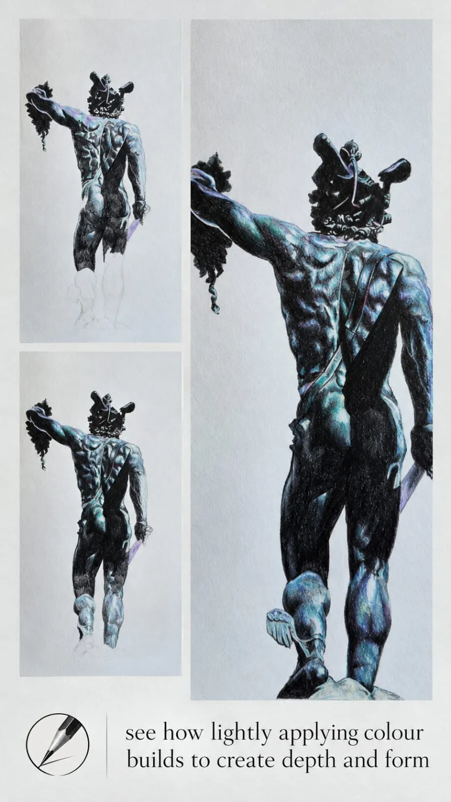
Key takeaways
- ◆An underpainting is a muted first pass - greys, blues and ochres - that establishes shadows and colour temperature before final colour.
- ◆It works like building the skeleton before the skin: it gives structure, direction and atmosphere.
- ◆Grisaille is a monochrome value underpainting; a complementary underpainting uses a colour opposite the final one for extra vibrancy.
- ◆It is especially useful in portraits and still life, where form and mood matter most.
- ◆Keep every underpainting layer light so the tooth stays open for the colour that follows.
A drawing can have accurate proportions and neat colour and still look flat, because the shadows were added at the end as an afterthought. An underpainting fixes that by building the shadows and colour temperature first, in muted tones, so the final colours have something solid to sit on.
This guide explains what an underpainting is, the two main approaches - grisaille and complementary underpainting - and a step-by-step method you can use on portraits and still life. It belongs to our complete guide to coloured pencil techniques and builds directly on how to layer coloured pencils.
What an underpainting does
An underpainting sets the mood. You use muted colours - greys, blues, ochres - to establish shadows and temperature before adding final colour. It creates depth and realism, especially in portraits and still life. The idea is the same as building the skeleton before the skin: it gives structure, direction and atmosphere, so that later colour has a form to describe.
Practically, it does four things:
- Fixes the values early. You solve light and shadow before you worry about colour.
- Sets colour temperature. Cool shadows and warm lights are established from the start, rather than hoped for at the end.
- Adds depth through optical mixing. The muted underlayer shows through later layers, giving them richness that a single pass cannot.
- Gives direction. Strokes in the underlayer follow form and guide the layers above.
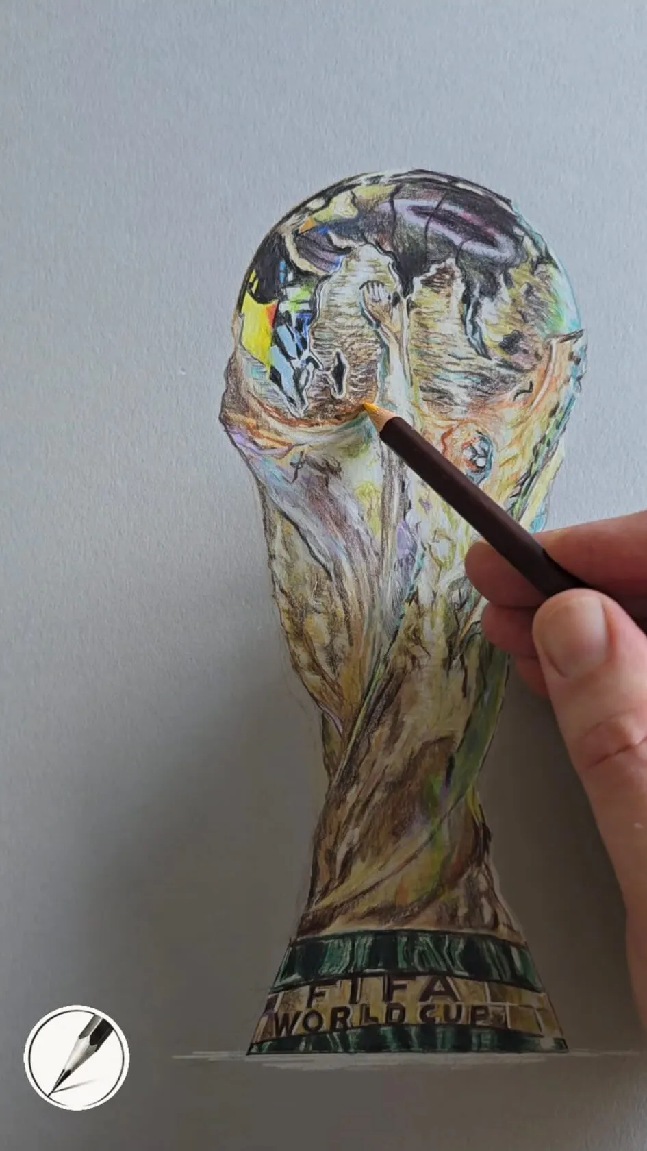
A hand drawing a gold trophy in coloured pencil on grey paper. Drawing by Michael Brace.
Two approaches: grisaille and complementary
Underpainting is an old idea in painting, and the accepted terms carry over to coloured pencil.
Grisaille
A grisaille is a monochrome underpainting, traditionally in greys, that describes the values of a subject before any local colour is added. In coloured pencil you might use a cool grey, a neutral brown or a single muted hue. Because it removes colour from the equation, you can concentrate on form, light and shadow.
Grisaille is the most forgiving option and suits beginners, portraits and any subject with strong modelling. The catch is that colours laid over grey can look a little muted, so it is worth using saturated final layers.
Complementary underpainting
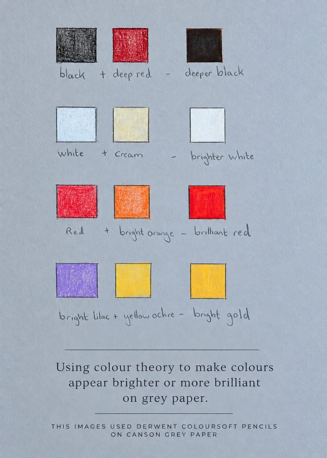
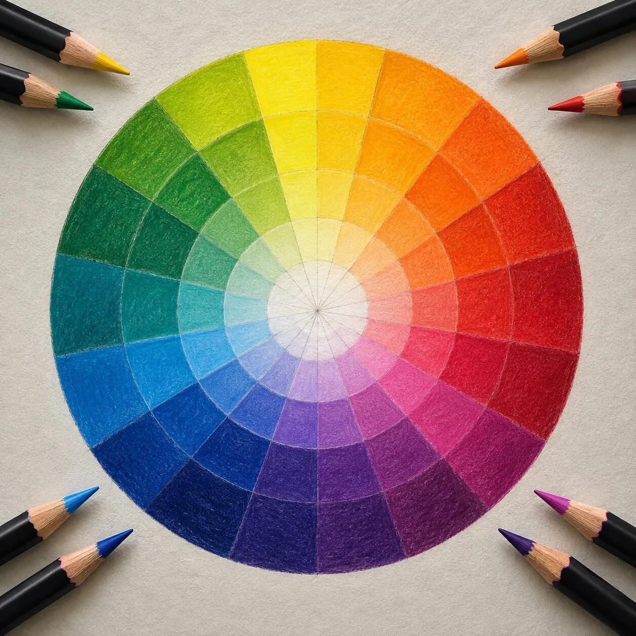
A complementary underpainting uses a colour opposite the final colour on the colour wheel: a cool blue-green beneath warm skin, or a muted violet beneath yellow. Complementary colours dull and deepen each other when layered, so shadows become rich rather than flat, and small glimpses of the underlayer add vibrancy to the surface. See complementary colours in drawing and the colour wheel explained for the theory.
Temperature-based underpainting
A third approach follows the classic warm-and-cool logic: cool underpainting for shadow areas, warm for light. It matches how light behaves, where lit surfaces tend to read warm and shadowed surfaces cool, or the reverse under other light. Our guide to colour temperature: warm and cool explains how to judge it.
Choosing your underpainting colours
Michael’s choices are muted greys, blues and ochres. A quick guide:
| Colour | Use it for | Effect |
|---|---|---|
| Cool grey | Neutral shadows and general values | Calm, controlled modelling |
| Blue or blue-grey | Cool shadows, atmosphere | Depth and recession |
| Ochre or warm brown | Warm mid-tones, skin, wood | Warm base that glows through |
| Muted complement | Vibrancy in the final colour | Richer, more alive shadows |
Test combinations on scrap paper of the same type. Layers behave differently on grey and white paper, so swatch first. Our guide to how to match and mix colours with pencils shows how.
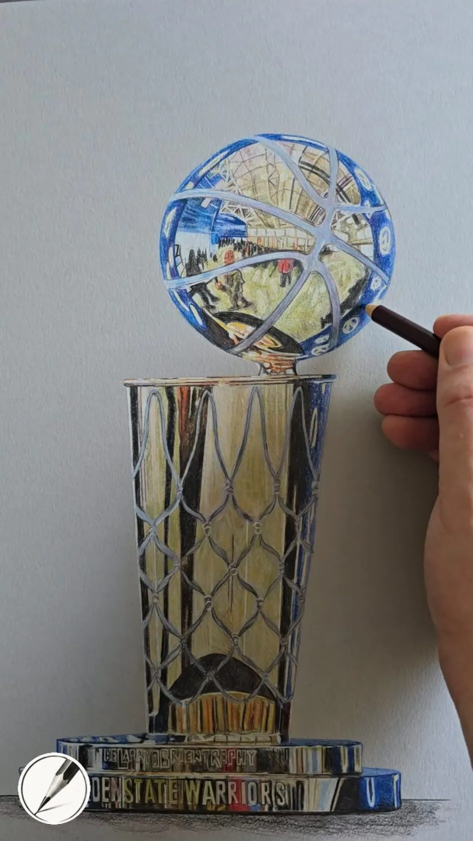
A hand adding detail to a trophy drawing in coloured pencil on grey paper. Drawing by Michael Brace.
Step-by-step: a grisaille underpainting
- Plan the values. Use the value study tool or squint at the reference to find the main light and dark shapes.
- Lay out lightly. Draw the outlines with a light, sharp pencil. Use the grid drawing tool if you want to transfer proportions carefully.
- Choose one or two muted pencils. A cool grey and a warm neutral cover most subjects.
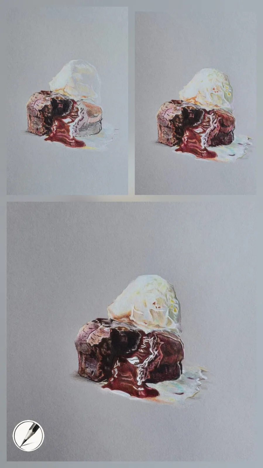
- Build the shadow shapes first, with light pressure. Follow the form: curve with a curved surface, run along a limb or a fold.
- Add mid-tones in further thin layers. Keep the whole drawing progressing together.
- Leave the lights as paper or nearly so. The lightest areas stay untouched or very pale.
- Check the values. Squint, or take a phone photo in black and white. Adjust before any colour goes on.
- Keep the tooth open. Do not burnish or press hard. The colour layers need to grip.
Step-by-step: adding colour over the underpainting
- Start with the lightest local colours. Layer them lightly over the underlayer, following the form.
- Build the main colour in thin layers, alternating stroke direction.
- Let the underpainting show in the shadows. Deepen shadows with saturated darks rather than black.
- Introduce warm and cool shifts. Use the temperature already set by the underpainting to guide you.
- Refine edges and detail. Sharpen where the subject is sharp, soften where it turns away.
- Blend and burnish selectively. See how to blend coloured pencils and how to burnish coloured pencils.
- Lift highlights last. See lifting and erasing coloured pencil.
Underpainting for portraits
Portraits benefit most because skin is layered and shadow structure carries likeness. A cool grey or blue-grey underlayer in the shadow planes of the face gives the form a solid base, and a warm ochre in the lights sets a natural glow. Rose, brown and warm reds then go on top. See how to draw portraits in coloured pencil for the full method and how to mix skin tones for colour choices.
Underpainting for still life
Still life gives you clear, simple shapes to practise on. Underpaint the shadow sides and cast shadows in cool greys and blues, and the warm objects will feel anchored to the surface. On grey paper, which already supplies a mid-tone, the underpainting can be minimal; on white or cream paper it does more of the work. Our comparison of why use grey paper explains the difference, and how a realistic drawing comes together shows the whole sequence.
Paper and pencil notes
Underpainting depends on the paper accepting many thin layers. Heavy paper with some tooth works best, and Michael favours heavy papers because they stay flat and let you build dozens of layers without the surface breaking down. Firmer pencils suit controlled underlayers, and softer ones cover quickly. See the best paper for coloured pencils and wax versus oil-based coloured pencils.
How muted is muted?
The word “muted” trips people up. It does not mean grey and lifeless; it means lower in saturation than the final colour, so the underlayer supports rather than competes. A useful test is to squint at the underpainting. If a single colour jumps out, it is too strong. If the drawing already reads as a soft, low-contrast version of the subject, with the shadow shapes clearly placed, it is about right.
Temperature is the other thing to watch. A cool underlayer under a warm subject gives shadows a natural coolness and makes the lights feel warmer by contrast. A warm ochre underlayer under cool colours does the reverse. Decide which relationship you want before you start, and stay consistent across the drawing so the light feels like a single light source.
When to skip it
Not every drawing needs an underpainting. If the subject is simple and bright, or the paper already provides the mid-tone you need, you may go straight to colour. Glossy, high-contrast subjects on grey paper often rely on a few well-placed darks and lights rather than a separate underlayer. The technique earns its keep on subjects where shadow structure and mood do the heavy lifting, and it is worth practising on one such piece to see the difference for yourself.
Common underpainting mistakes
- Heavy pressure. It blocks later layers. Stay light.
- Too much colour. The underlayer should be muted; it supports the final colour rather than competing.
- No value check. If the underpainting is wrong, the colour on top will be wrong too.
- Overworking. Stop when the form reads. The colour layers do the rest.
See it in action in our lessons on drawing realistic eyes and drawing a portrait from a photo, and check colour choices with the palette from photo tool. Coloured pencils are called colored pencils in the US, and everything in this guide applies to both.
The short version
Build a muted underpainting in greys, blues and ochres to set shadows and temperature, keep it light, and check the values before adding colour. Use grisaille for control or a complementary colour for vibrancy. It is the skeleton the rest of the drawing hangs on. Return to coloured pencil techniques for the wider workflow.
Where to buy
Recommended products
Affiliate links. We may earn a small commission if you buy, at no extra cost to you. Why?
Pencils · Faber-Castell
Faber-Castell Polychromos
Firm, oil-based artist pencils that hold a point - a benchmark for detail and clean layering.
Pencils · Derwent
Derwent Coloursoft Pencils
Soft, velvety and richly pigmented - excellent for painterly blending and bold colour.
Paper · Arches
Arches Hot Press Paper
Smooth, archival paper prized for portraits, fine detail and subtle blending.
Quick answers
Frequently asked questions
What is an underpainting in coloured pencil?+
It is a first, muted layer of colour that establishes the shadows, form and temperature of a drawing before the final colours are added. Typical choices are greys, blues and ochres. It is built lightly, so later layers of local colour sit over it and gain depth from what shows through.
What is a grisaille?+
Grisaille is a monochrome underpainting, traditionally in shades of grey, that establishes the values of a subject before colour is added. In coloured pencil, artists may use grey, a neutral brown or a single muted hue. It separates the job of getting values right from the job of choosing colour.
What is a complementary underpainting?+
It is an underlayer in a colour opposite the final colour on the colour wheel, such as a cool blue-green beneath warm skin or a muted red beneath foliage. Complementary colours dull and deepen each other in layers, and small glimpses of the underlayer add vibrancy and richness to the finished surface.
Do I need an underpainting for every drawing?+
No. It helps most with portraits, still life and any subject where shadow, form and mood matter. Simple, bright or graphic drawings may not need it. If you tend to struggle with flat colour or muddled shadows, an underpainting is a reliable way to fix both.
Does underpainting work the same in colored pencil?+
Yes. Colored pencil is the US spelling of coloured pencil, so grisaille and complementary underpaintings work the same way. Keep the underpainting light so later layers can still grip the paper.