Graphite & Charcoal
How to Shade with Pencil: A Step-by-Step Guide
Learn pencil shading with pressure control, grip, value scales, gradients and simple forms, plus a seven-day practice sequence to build smooth, even tone.
Key takeaways
- ◆Smooth shading comes from pressure control and many light layers, not from pressing hard.
- ◆Hold the pencil further back and use the side of the lead for broad, even tone.
- ◆Practise a value scale and a smooth gradient before shading real subjects.
- ◆Shade forms such as a sphere and cylinder to learn how tone follows light.
- ◆Build from light to dark and vary your stroke direction slightly with each layer.
Shading is the skill that turns a flat outline into something with weight. It is also where most beginners stall: the tone looks patchy, streaky or scratchy, and the harder they press to darken it, the worse it gets. The fix is not more effort but better control, which is a set of habits you can train.
This guide explains the mechanics: how to hold the pencil, how to control pressure, how to build a value scale and smooth gradient, how to shade forms and how to layer from light to dark. It ends with a seven-day practice sequence. If you want to know which pencils suit these exercises, see our guide to graphite pencil grades first.
The basics of pressure
Graphite pencils do not get darker mainly because you press harder. They get darker because you lay down more layers. Light pressure leaves tiny flakes that sit on the peaks of the paper’s texture; more layers fill the valleys. Heavy pressure flattens those peaks and can leave shiny, hard-to-lift marks that cannot take more graphite.
Aim for three pressure levels and learn to feel the difference:
- Light: barely touching, like stroking the paper. Used for the first layers and pale tone.
- Medium: a firm but relaxed touch. Used for mid-tones.
- Firm: used only at the end for the darkest accents, and preferably with a softer grade.
Build tone with several light layers and save the firm layer for the finish. If your hand is tense, the tone will come out uneven. Relax the grip, and let the weight of the pencil and hand do the work.
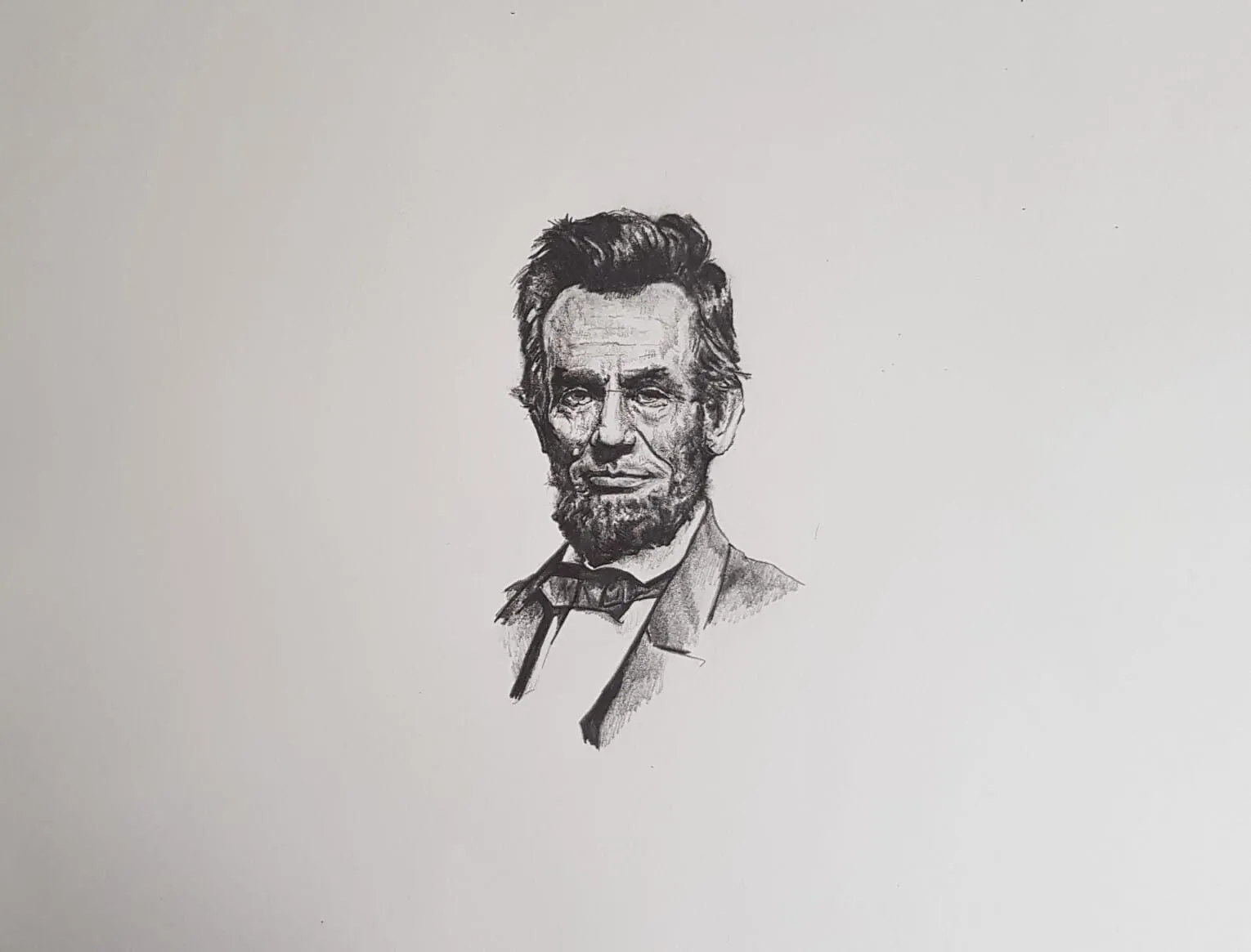
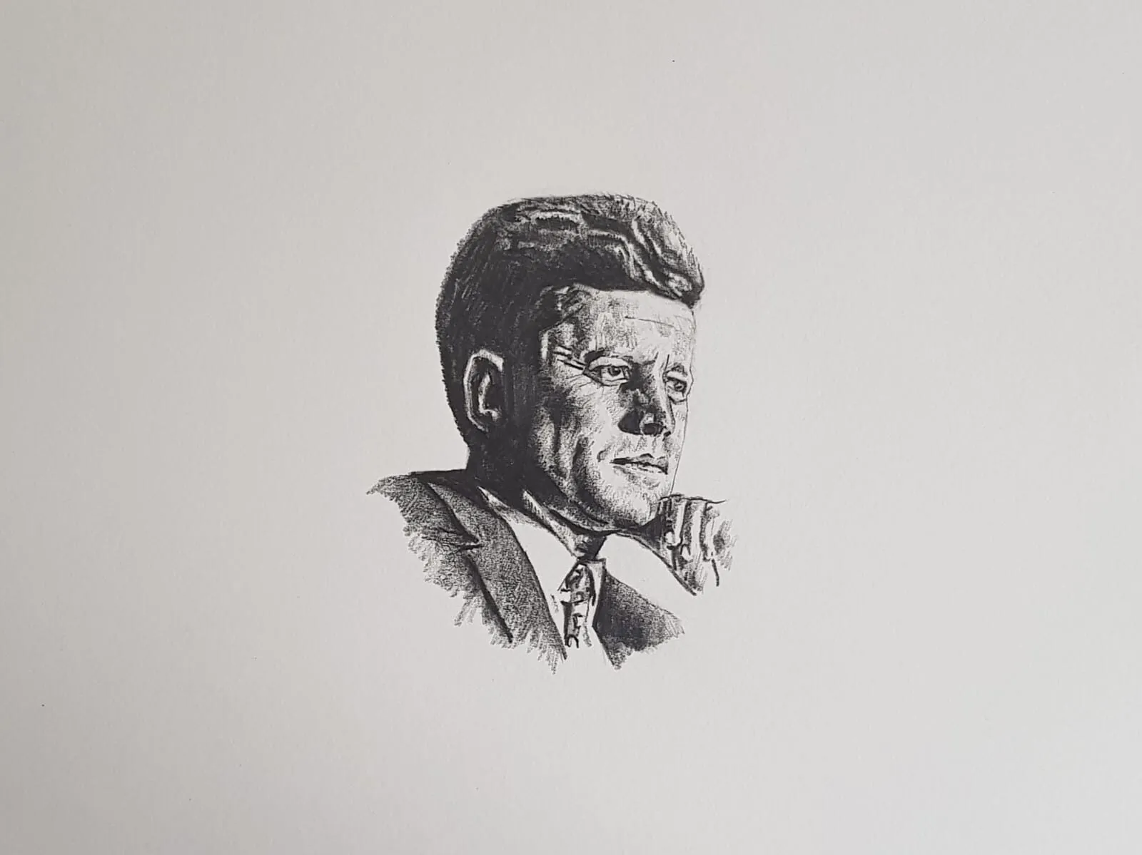
A graphite portrait of Abraham Lincoln. Drawing by Michael Brace.
Grip and angle
There are two grips worth learning.
The writing grip holds the pencil close to the point. It gives precision for small areas and fine lines, but it also encourages pressing and short strokes.
The overhand or tripod-back grip holds the pencil further back on the barrel, with the pencil at a low angle to the paper. This uses the side of the lead, covers a broad area in one pass and naturally reduces pressure. It is the grip for smooth shading.
Move from the elbow and shoulder for larger areas and from the wrist for medium ones. Drawing entirely from the fingers gives stiff, short, uneven strokes. Try shading a square using only wrist movement, then again with the whole forearm, and compare the smoothness.
Use the side of the lead
A sharp point makes thin lines, which take a long time to fill an area and often show as parallel stripes. The side of the lead makes a wide, soft mark with less pressure. To use it, expose a little extra lead by sharpening with a knife or sanding block, or use a woodless pencil, and lay the pencil almost flat on the paper. Sweep across the area with overlapping strokes.
Keep a sharp point for edges and details, and a broader, dulled or angled point for shading. Many artists keep two pencils of the same grade, one for each job.
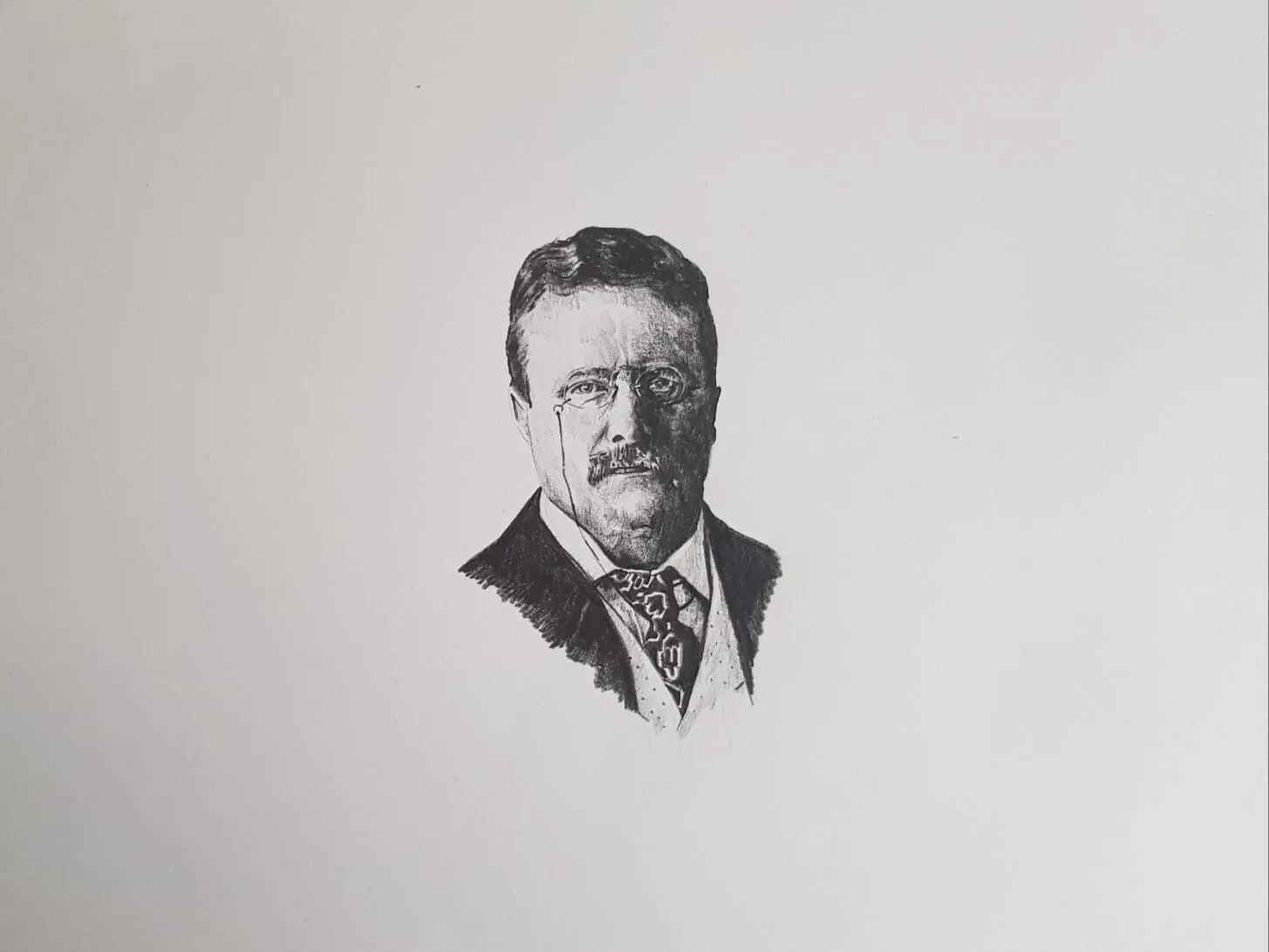
A graphite portrait of Theodore Roosevelt. Drawing by Michael Brace.
Make a value scale
A value scale is a strip of boxes from white to nearly black, with even steps between. It is the most useful exercise for shading because it trains your eye and your hand together.
- Draw a strip of five to nine boxes, each about 2 to 3 cm wide.
- Leave the first box white.
- Shade the last box as dark as you can without pressing hard, building layers with a soft grade.
- Fill the boxes in between so each step is evenly darker than the last.
Do it first with one pencil, then with several grades. Compare your scale to the value study tool to check that the steps look even when reduced to grey. If two neighbours look the same, darken one; if one jump is too large, add a step. Our guide to value in drawing explains why value matters more than detail.
Draw a smooth gradient
A gradient moves from light to dark in one continuous transition with no bands. It is harder than it looks.
- Draw a rectangle about 15 cm long.
- Start at the dark end with a soft pencil and medium pressure, using overlapping side-of-lead strokes.
- Move toward the light end, reducing pressure gradually so the tone fades.
- Repeat the whole rectangle with a second layer, again fading toward the light end.
- Build up in four or five layers until the dark end is deep and the light end is clean.
If you see stripes, your strokes are too far apart or your angle is inconsistent. If you see grain, the pressure was too heavy. Try changing direction slightly on every layer, for example a 15 degree shift, so that no single stroke direction dominates. The result is far smoother than any single-direction pass.
Shade simple forms
Once you can shade a gradient, apply it to forms. Forms teach you how tone follows light, which is the foundation of every realistic drawing.
The sphere
A sphere shows every tonal area in one shape. Choose a light direction, say from the upper left, and shade:
- Highlight: the brightest spot, left as white paper or lifted later.
- Light tone: the area around the highlight.
- Mid-tone: the middle of the form.
- Core shadow: the darkest part of the form itself, on the shadow side, just before the edge.
- Reflected light: a slightly lighter band on the edge of the shadow side where light bounces back from the surface below.
- Cast shadow: the dark shape on the surface, at its darkest near the form.
Shade with curved strokes that follow the surface, working from light to dark.
The cylinder
A cylinder is a good bridge between flat and curved. The tone changes across the width but not down its length, so you can use straight strokes along the length while the pressure varies across it. Use it to practise a controlled gradient in a defined shape, and for the cast shadow it throws.
The cube
A cube has flat planes, each of a single tone, so it shows the difference between flat tone and curved tone. Shade each face evenly, with the three visible faces clearly different in value.
Stroke direction
The direction of your strokes affects both the look and the smoothness of tone. Three approaches are common:
- Consistent direction: all strokes parallel. Fast, but shows lines and can look mechanical.
- Alternating direction: each layer at a slight angle to the last. Best for smooth tone.
- Following the form: curved strokes that trace the surface, so the marks themselves describe the shape. This is especially useful on fur, cloth and round objects.
Change direction between layers, not within one. Consistent strokes inside a single layer keep the tone even; switching between layers stops streaks building up. For lines you want to see, see hatching and cross-hatching; for smoother results, see how to blend graphite.
Layer from light to dark
The golden rule: build from light to dark. It is easy to add tone and hard to remove it, so you want to stay in control. A dependable order:
- Layout with a hard pencil, 2H or HB, using very light lines.
- First tone across all shaded areas with a hard or mid pencil, light pressure.
- Mid-tones with a mid to soft pencil, such as 2B, in overlapping layers.
- Shadows with a soft pencil, such as 4B, over the shadow shapes.
- Darkest accents with the softest pencil, such as 6B, only where necessary.
- Lift and refine highlights with a kneaded eraser. See the best erasers for graphite.
Move across the whole drawing at once rather than finishing one corner. That keeps the values in relation to each other and makes it easy to see when the drawing needs more contrast.
A seven-day practice sequence
Twenty to thirty minutes a day is enough.
| Day | Exercise | Focus |
|---|---|---|
| 1 | Value scale, 5 boxes, one pencil | Even steps |
| 2 | Value scale, 9 boxes, three grades | Range and control |
| 3 | Smooth gradient, 4 layers | Stroke overlap |
| 4 | Sphere with cast shadow | Form and light |
| 5 | Cylinder and cube | Flat versus curved tone |
| 6 | Still life of two simple objects, such as an egg and a cup | Combining forms |
| 7 | Redo day 1 and day 3 | Measure progress |
Keep every page. Comparing day 1 with day 7 is the most motivating part of the sequence.
Common shading mistakes
- Pressing hard too soon. Tone becomes shiny and cannot take more graphite.
- Shading in tiny circles. Circular scribble is slow and leaves a mottled texture; use longer strokes.
- Ignoring the paper. A sheet that is too smooth or too soft will show every flaw. See the best paper for graphite drawing.
- Uniform tone. A drawing needs a full range from light to dark; check with a squint or the value study tool.
- Outlining before shading. Dark lines around a form flatten it; let tone define edges.
Where to go next
Shading is one of three core skills. When you feel comfortable with smooth tone, learn hatching and cross-hatching for visible, controlled line work, then how to blend graphite. For a broader overview of everything in this section, visit the graphite and charcoal guide.
Put shading into practice with the basic forms and shading lesson and the shadows and light lesson, or start the 30 day drawing challenge.
The short version
Press lightly, hold the pencil back and use the side of the lead. Practise a value scale and a smooth gradient, then shade a sphere, cylinder and cube. Build from light to dark in many thin layers, changing stroke direction slightly each time, and keep a slip sheet under your hand. Seven days of short practice will make a visible difference.
Quick answers
Frequently asked questions
How do I shade smoothly with a pencil?+
Use light pressure, the side of the lead and many thin layers, changing stroke direction slightly each time. Work on paper with a little tooth, keep the pencil sharp or slightly rounded, and avoid pressing hard early. Smoothness comes from overlapping, evenly spaced strokes and patience rather than a single dark pass.
Which pencil is best for shading?+
A soft to mid grade such as B, 2B or 4B is best for most shading because it gives tone with light pressure. Use harder grades for pale, early layers and softer grades for deep shadows. Using several grades produces smoother results than forcing one pencil to do everything.
Why does my shading look streaky?+
Streaks usually come from uneven pressure, strokes that are spaced apart, or always shading in the same direction. Overlap your strokes, keep the pencil angle constant, and change direction slightly with each layer. Very smooth paper can also show streaks; a little more tooth often helps.
How long does it take to learn shading?+
Basic control of tone, meaning a smooth gradient and simple forms, can improve within a few weeks of short daily practice. Confident shading of complex subjects takes longer. Regular, focused exercises beat occasional long sessions, and progress is easiest to see if you keep your old practice sheets.