Colour Theory
How to Mix Grey and Neutral Colours with Coloured Pencils
Mix lively greys and neutrals with coloured pencils (colored pencils in the US) from complements, then steer them warm or cool and use them in shadows.
This guide contains affiliate links. If you buy through them we may earn a small commission at no cost to you. How this works.
Jump to recommended products
Key takeaways
- ◆A chromatic grey is made by layering a colour with its complement, and it looks richer than a grey from a single grey pencil.
- ◆The proportions decide the temperature: more of the warm colour gives a warm grey, more of the cool gives a cool grey.
- ◆To mute a colour, glaze a little of its complement over it instead of adding grey or black.
- ◆Greys from mixed colours harmonise with the rest of the drawing, so use them for shadows, snow, skies and metal.
- ◆Keep one or two grey pencils for convenience, but let mixed neutrals do most of the work.
A grey mixed from two colours has more life than a grey straight from a pencil. It carries a hint of warmth or coolness, it echoes the colours around it, and it changes from one layer to the next. For shadows, snow, skies, metal and skin, that life is the difference between a drawing that looks observed and one that looks filled in.
This guide is written for coloured pencils, known as colored pencils in the US. It explains how to make chromatic greys from complements, how to steer them warm or cool, how to mute a colour without deadening it, when to use a grey or black pencil, and how neutrals behave in shadow. It sits in the colour theory cluster next to saturation and muted colours, and you can pull candidate neutrals from a photograph with the palette from photo tool.
What makes a grey or neutral
A neutral is a colour with little or no saturation. In pencil you can reach one in three ways:
- Layer a colour with its complement. The two cancel each other out. This is the main method.
- Layer all three primaries. The result is similar but with more control and more layers.
- Use a ready-made grey pencil, alone or with a colour layered on top.
Drawing greys from the colours you are already using is what makes a palette cohere. A drawing built from a limited set of pencils, as in limited palette drawing, gets its neutrals automatically from those pencils.
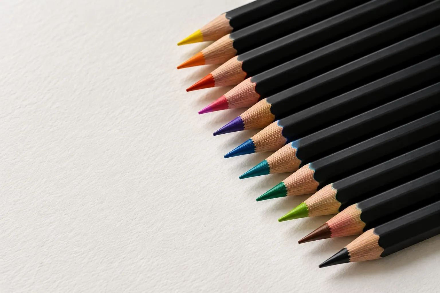
A row of sharpened coloured pencils fanned across white paper.
Chromatic greys from complements
Pairs to start with:
| Pair | Leaning warm | Leaning cool |
|---|---|---|
| Orange + blue | More orange: a warm, brownish grey | More blue: a cool, steely grey |
| Red + green | More red: a pinkish or reddish grey | More green: a greenish grey |
| Yellow + violet | More yellow: a sandy grey | More violet: a lilac grey |
The recipe is always the same.
- Lay a light, even layer of the first colour.
- Glaze the complement over it, lightly, in a different direction.
- Step back and compare the swatch to the tone you want.
- Add a little of whichever colour is missing, and repeat until the mix is neutral.
Go slowly. Two colours balanced at equal strength give the flattest, most neutral grey, and a small shift in pressure changes the outcome a lot. You can swatch this on your own paper by laying down a row of squares, changing the proportion a little from each square to the next. The row becomes a map from warm to cool.
Warm greys and cool greys
Temperature matters because the eye reads neutrals against their surroundings. A grey that looks warm beside a blue can look cool beside an orange. Decide the temperature from your reference, not from the pencil.
- Warm greys suit sunlit stone, dry grass shadows, animal fur in sun, and skin in warm light.
- Cool greys suit snow shadows, overcast skies, metal, and the shadow side of a face in cool light.
If you are unsure which way to push, look at the light source. Shadows often lean toward the opposite temperature of the light: warm light gives cooler shadows, and cool light gives warmer ones. More on this is in colour temperature: warm and cool.
Close-up of sharpened pencils with grey leads on textured paper.
Muting a colour without killing it
Often you do not want a grey. You want a dulled version of a colour, such as a red that is quieter or a green that is less sharp. The best way to do that is to glaze a small amount of its complement over it.
- A red that is too bright: glaze a little green over it.
- A green that looks artificial: glaze a little red or orange over it.
- A blue that jumps out of the picture: glaze a little orange over it.
This works better than layering grey over a colour, because grey can make the colour look chalky, while a complement keeps it looking rich. The approach is the same one the complementary colours guide applies to shadows. For how saturation works, see saturation and muted colours.
Greys from mixing versus black and grey pencils
A black or grey pencil has real uses. It gives a reliable, even tone, it is fast for large neutral areas, and it is handy for underlayers. The downside is that it is a single, flat colour, and on its own it often looks heavy or dead next to colourful layers.
A good approach:
- For large areas such as sky or background, mix from the palette you are using so the neutral belongs to the picture.
- For quick value work, use a grey pencil as a base and layer colour over it to add temperature.
- For the very darkest darks, use layered deep colours instead of straight black. That has its own guide: how to make black with coloured pencils.
Some artists keep a warm and a cool grey pencil for convenience, then adjust by layering. That is a practical, honest compromise, and it saves time without losing colour.
Neutrals in shadows
Shadows are where neutrals earn their keep.
- Start with the local colour. A shadow on a red apple is a darker, duller red, not a grey patch.
- Push the shadow cooler or toward the complement. A little green or blue in a red shadow usually looks natural.
- Vary the neutral within the shadow. Reflected light from nearby surfaces makes the edge of a shadow warmer and lighter than its core.
- Keep shadow values connected to the rest of the drawing. Check your value structure with the value study tool so the neutral does not break the picture’s light and dark pattern. The principles are in value in drawing.
Cast shadows on white or grey paper
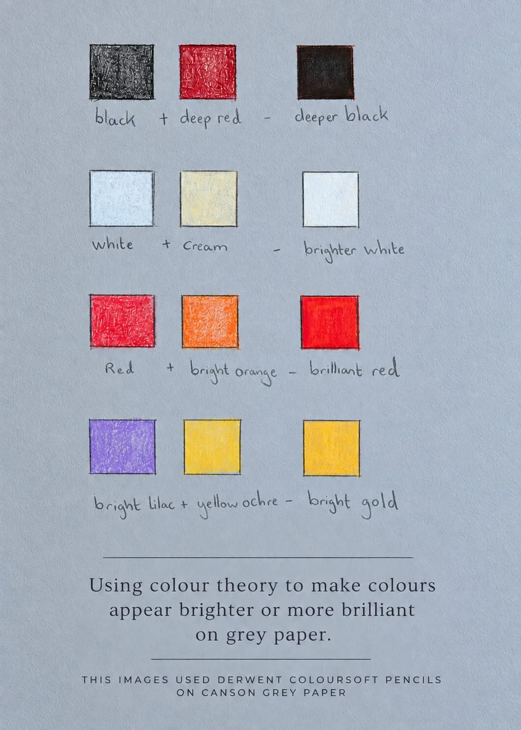
On white paper, light layers of a cool neutral work well for cast shadows in snow or on a pale surface, and the paper stays as the highlight. On grey paper, the paper is already a neutral, so a thin layer may look only slightly darker than the ground. Bring in a cool or warm tint to shift the temperature, and use white for highlights. The pairing theory is covered in colour theory on grey paper.
Common mistakes
- Reaching straight for black to darken or dull. It kills saturation and temperature together.
- Making one grey for the whole picture. Real neutrals shift with light, distance and reflection.
- Going too grey. Over-neutralising flattens colour. Keep some areas of saturation as the focus.
- Mixing too heavily. Filling the tooth with the first two colours leaves no room for corrections. Keep layers light.
- Forgetting value. A grey that is the right temperature but the wrong value still looks wrong. Match both.
A quick exercise: a grey scale from complements
Make a strip of six squares across your paper. In the first, lay a light orange. Over each following square, add a little more blue, so the last square is mostly blue with a trace of orange. You will see the strip move from a warm tan, through a neutral grey, to a cool blue-grey. Now repeat with red and green, and with yellow and violet. In an hour you will have three maps of neutrals that belong to your pencils, and you can match any grey in a reference to a square.
If you want to go further, add white or a pale tint over one half of each strip to see the light versions. Label the order of layers so you can repeat it. This is the same habit as the mixing chart and it is worth keeping the strips for future drawings.
Using neutrals to make colour look stronger
Neutrals are not just for shadows. A small area of saturated colour looks stronger when it is surrounded by muted greys, because the eye reads the contrast. That is why a single red scarf against a soft grey wall draws attention, and why a drawing with every colour at full strength feels noisy. Plan where the quiet areas go, and choose a palette that includes them: see how to choose a colour palette for a drawing.
The short version
Make greys by layering complements in light glazes and balancing them. Shift the proportion to go warm or cool, mute colours with a touch of their complement, and use a grey pencil as a tool rather than a rule. Swatch on your own paper, and build shadows from neutrals that belong to the drawing. Continue with the colour theory hub for the rest of the series.
Where to buy
Recommended products
Affiliate links. We may earn a small commission if you buy, at no extra cost to you. Why?
Pencils · Faber-Castell
Faber-Castell Polychromos
Firm, oil-based artist pencils that hold a point - a benchmark for detail and clean layering.
Quick answers
Frequently asked questions
How do I make grey with coloured pencils?+
Layer two complementary colours, such as orange with blue or red with green, in light layers and balance them until neither colour dominates. The result is a neutral grey with a slight temperature. Add a pale tint or let the paper show for a lighter grey.
Is it better to use a grey pencil or mix grey?+
Both are useful. A grey pencil is quick and handy for even tones. Mixed greys are richer and tie into the colours around them, which makes them better for shadows and large areas. Many artists layer a grey pencil with a touch of colour for speed plus life.
How do I make a grey warmer or cooler?+
To warm a grey, layer a little orange, red or yellow over or under it. To cool it, add blue or blue-green. You can also mix from the start with more of a warm or cool member of a complementary pair. Judge each change on a swatch on your own paper.
What colour should shadows be?+
Shadows are rarely pure grey or black. They are usually a darker, muted version of the object colour, pushed cooler or toward the complement. A mixed neutral in the shadow looks more natural than a grey pencil on its own. Check against your reference for the exact temperature.
Are colored pencils and coloured pencils the same?+
Yes. Coloured pencils is the UK spelling and colored pencils is the US spelling, and they are the same product. The neutral mixing methods here apply to both.