Colour Theory
Colour Theory on Grey Paper
How grey paper changes the way pencil colours look, and how to use layered pairings, opaque underlayers and white pencil to make colours brighter on grey.
This guide contains affiliate links. If you buy through them we may earn a small commission at no cost to you. How this works.
Jump to recommended products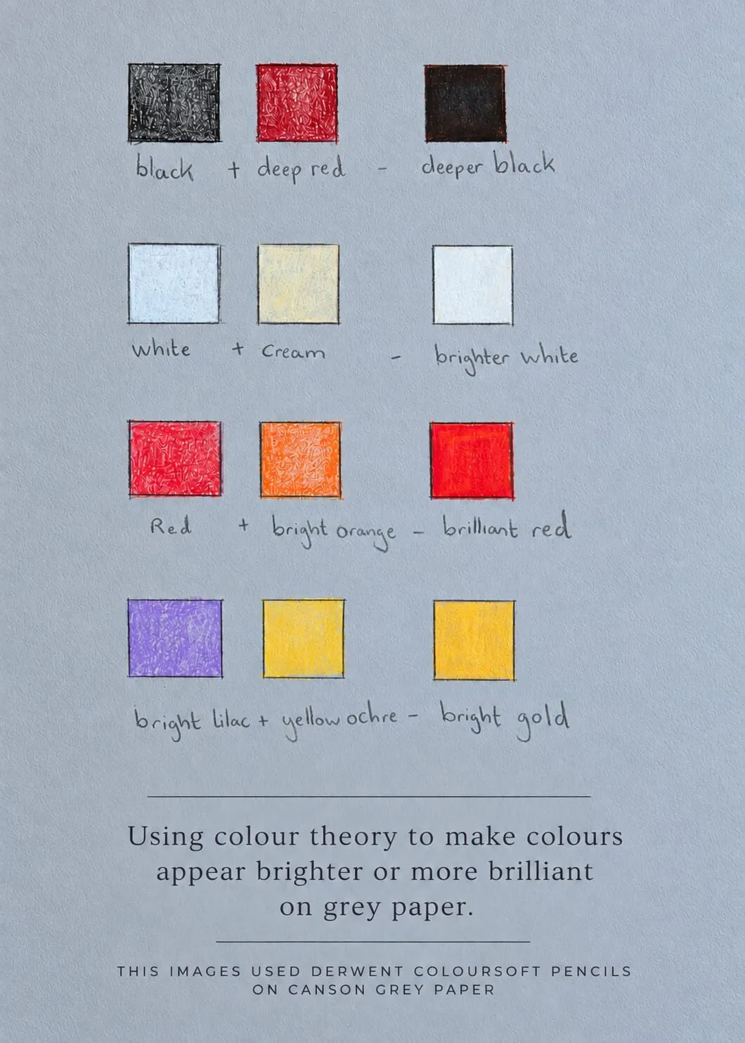
Key takeaways
- ◆Grey paper is a mid-tone that changes how every colour looks, through simultaneous contrast with the colours around it.
- ◆Layered pairings can make colours look brighter or deeper: black over deep red, white with cream, red with bright orange, bright lilac with yellow ochre.
- ◆Opaque, creamy pencils cover the grey and restore saturation, and a related underlayer can make the top colour look brilliant.
- ◆White pencil on grey is a true highlight, something white paper cannot give you.
- ◆Always swatch on the paper you draw on. The same pencil can look different on white, cream and grey.
Grey paper does something white paper cannot: it gives you a mid-tone to work from. That changes how you plan a drawing, and it also changes how colour behaves. Pencils that look modest on white can glow on grey when they are paired well, and pairings that work on white can look muddy. Colour theory is what tells you which is which.
Michael made a swatch card to show exactly this. It uses Derwent Coloursoft on Canson grey paper, and its caption reads “Using colour theory to make colours appear brighter or more brilliant on grey paper.” This guide takes that card apart, explains why it works, and shows how to build your own. It is part of the colour theory cluster and pairs with why use grey paper for coloured pencil. This is written for coloured pencils, known as colored pencils in the US. White pencils do a lot of the work, so see best white pencils for drawing on grey paper, and for the darkest ground read drawing on black paper.
The swatch card
The photograph at the top of this page is the finished card. Here are its pairings broken down.
The card shows four pairings.
| Pairing | Result | What is happening |
|---|---|---|
| Black + deep red | A deeper black | The red underneath stops the black looking flat or grey |
| White + cream | A brighter white | The cream warms and fills the tooth, so the white sits cleaner on top |
| Red + bright orange | A brilliant red | The orange brightens and warms the red, so it glows |
| Bright lilac + yellow ochre | A bright gold | Violet and yellow oppose each other, so the gold looks richer |
These are Michael’s own combinations, and they are a starting point, not a universal recipe. Colour ranges differ, so a different set of pencils will give a slightly different result. The principle carries over: a colour is affected by what sits under and beside it, and you can use that on purpose.
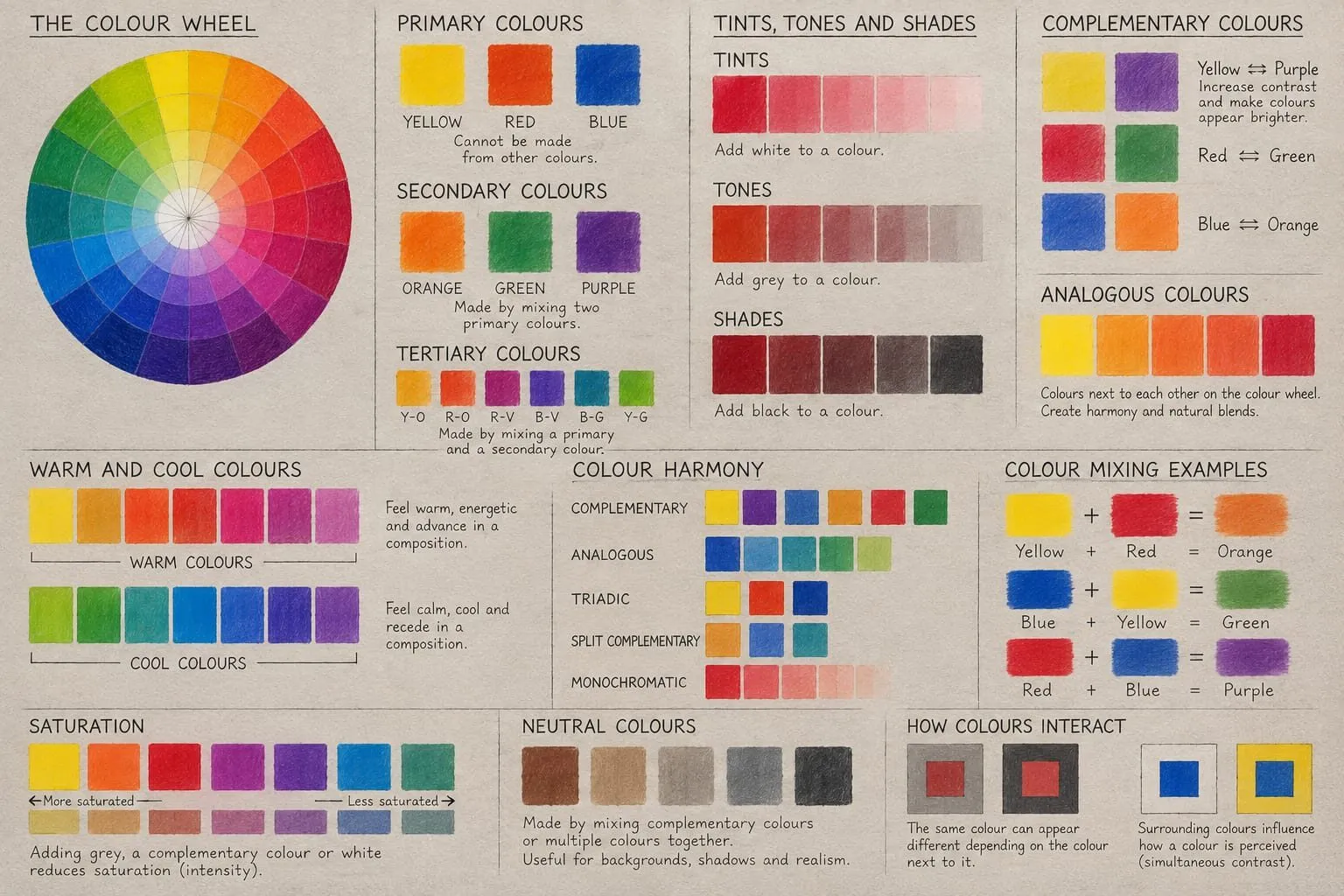
A hand-lettered colour theory chart showing the colour wheel, primary, secondary and tertiary colours, tints, tones and shades, harmony schemes and mixing examples.
How grey paper changes perceived colour
Two things are going on.
1. The paper shows through. Coloured pencil is translucent in thin layers, so the paper colour mixes optically with the pigment. On grey, a light layer of yellow looks slightly greyer and duller than it would on white. That is neither good nor bad, just something to allow for.
2. Simultaneous contrast. We never see a colour alone. A colour looks different depending on its surroundings, and a mid-grey ground pulls colours in predictable ways. Light colours look brighter against it because they are lighter than the ground. Saturated colours look strong against the neutral, because a neutral ground makes them stand out. Warm and cool colours also read more clearly, because the grey does not compete.
Put together: on grey paper, light and saturated marks can look more luminous than on white, where they sit close to the paper value. That is the effect Michael’s card exploits.
Ways to make colours brighter on grey
Use opaque, creamy pencils
Opaque pencils cover the grey and restore the colour’s own value and saturation. Softer, creamier pencils, such as Coloursoft, lay down a dense layer quickly. Harder, drier pencils let the paper show through more. Choose by the effect you want, and read our Derwent coloured pencils reviewed for how the ranges differ.
Put a related colour underneath
An underlayer of a brighter or warmer relative makes the top colour glow. On the card, orange under red gives a brilliant red, and cream under white gives a cleaner white. The underlayer is a thin, light layer, applied first. The general method is in underpainting in coloured pencil.
Use a complement to enrich
Opposites make each other look stronger. Bright lilac and yellow ochre are close to a violet and yellow opposition, which is why the pairing produces a gold that feels richer than yellow ochre alone. The theory is in complementary colours in drawing.
Underlay a deep colour for a deeper dark
Black on its own often looks slightly grey on a mid-tone paper. A deep red beneath it adds warmth and depth, giving a black that feels rich rather than flat. The same idea works with deep blue or deep green beneath black.
Add a white or pale tint first
A layer of white under a bright colour lifts and brightens it, because it hides the grey and gives the colour a lighter base. It also keeps the colour clean and opaque.
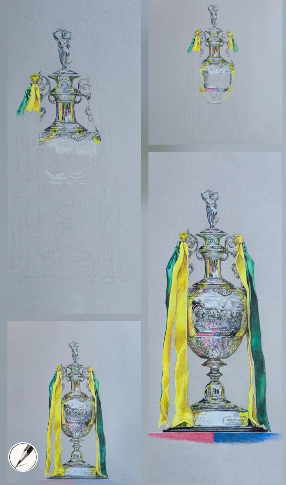
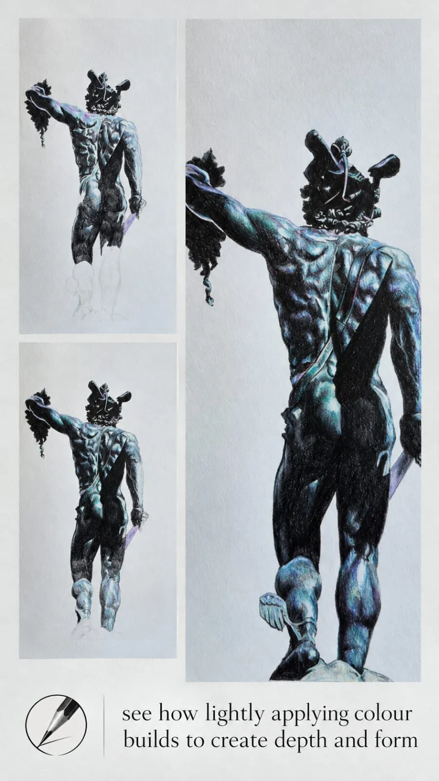
Silver on grey paper in stages: darks and midtones first, white highlights last.
The white pencil on grey paper
White is the star of grey paper work. On white paper the lightest tone you have is the paper itself. On grey, a white pencil is a real highlight sitting on a mid-tone, and your eye reads it as brighter than untouched white paper ever looks. Use it for:
- Highlights in metal, glaze, icing, glass and eyes.
- Tints. Layer white over a colour to make a paler, more opaque version.
- Underlayers, as described above.
- Blending light areas, where it smooths and unifies.
A good white pencil matters more on grey than anywhere else, as the paper article notes. Place highlights last, once darks and midtones are settled, so they sit crisp on top. The technique for reflective subjects is covered in how to draw glossy surfaces.
Building your own swatch card
- Choose your paper. Use the exact grey you plan to draw on.
- Choose ten to fifteen pencils you use most.
- Draw a grid of about 3 cm squares.
- Swatch each pencil alone, first with light pressure and then with heavy.
- Swatch each pencil over white, and over cream or a pale warm tone.
- Try pairings, such as a dark over its deep relative, or a bright over its warmer neighbour.
- Label everything with the layer order.
- Photograph the card in greyscale to check the values, or use the value study tool.
Then test possible palettes for a drawing in the colour scheme generator, and match them to your swatches.
Mistakes to avoid
- Trusting swatches from white paper. Colours shift on grey. Use the real paper.
- Pressing hard too early. Heavy first layers block later pairings. Build gradually.
- Overusing white. White highlights work because they are surrounded by darker tones. Too much white makes a drawing chalky.
- Choosing pencils that are too transparent. Thin, dry pencils can vanish on grey. Test opacity first.
- Forgetting value. Grey paper can hide value problems, so squint and check in greyscale. See value in drawing.
Choosing pencils for grey paper
Not every pencil suits a toned ground, and it is worth knowing why before you buy or use a set.
- Soft, creamy, opaque pencils cover the grey quickly and keep colour saturated. They are the natural choice for the brightening pairings on Michael’s card.
- Harder, drier pencils are more translucent, so the grey shows through. They are useful for fine detail and for cooling or muting an area on purpose.
- Pale colours such as pastel yellows and pinks can nearly vanish on mid grey unless they are opaque. Test them, and put a white underlayer beneath if they disappear.
- Dark colours show up easily, but on a mid-grey they can lose the extra depth you get on white, which is why the deep-red-under-black trick helps.
Whichever range you use, remember that the paper is a colour in your palette. A cooler grey pulls warm colours toward neutral, and a warmer grey does the reverse. If you are comparing papers, the best paper for coloured pencils guide sets out the main options and how they take layers.
The short version
Grey paper is a mid-tone that reshapes every colour through simultaneous contrast. Use opaque pencils, related underlayers, complementary pairings and a good white to make colours look brighter, and test them on a swatch card first. For more on the paper itself, see why use grey paper for coloured pencil, or return to the colour theory hub.
Where to buy
Recommended products
Affiliate links. We may earn a small commission if you buy, at no extra cost to you. Why?
Pencils · Derwent
Derwent Coloursoft Pencils
Soft, velvety and richly pigmented - excellent for painterly blending and bold colour.
Paper · Canson
Canson Mixed Media Grey Paper
A toothy mid-tone grey paper that grips pigment and makes highlights glow.
Quick answers
Frequently asked questions
Do colours look different on grey paper?+
Yes. Every colour is seen against the paper, so the grey changes how light, dark, warm or saturated a pencil mark appears. Thin layers let the grey show through and mute the colour. Opaque layers cover it. Always swatch your pencils on the same paper you will draw on.
How do I make colours look brighter on grey paper?+
Use opaque, creamy pencils, lay a related brighter underlayer first, and put white or a pale tint beneath or beside bright colours. Michael's swatch card shows red with bright orange for a brilliant red, and bright lilac with yellow ochre for a bright gold.
Should I use a white pencil on grey paper?+
Yes, a good opaque white is one of the most useful pencils on grey paper. It sits on top of the mid-tone and reads as a true highlight. You can also layer it under colours to lift them, or over them to make tints.
What is simultaneous contrast?+
It is the effect where a colour looks different depending on what sits next to it. A grey looks slightly warmer beside blue and slightly cooler beside orange. On grey paper, all your colours are seen against that neutral ground, which shifts how they read.
Are colored pencils and coloured pencils the same?+
Yes. Coloured pencils is the UK spelling and colored pencils is the US spelling, and they are the same product. The colour theory here applies to both.