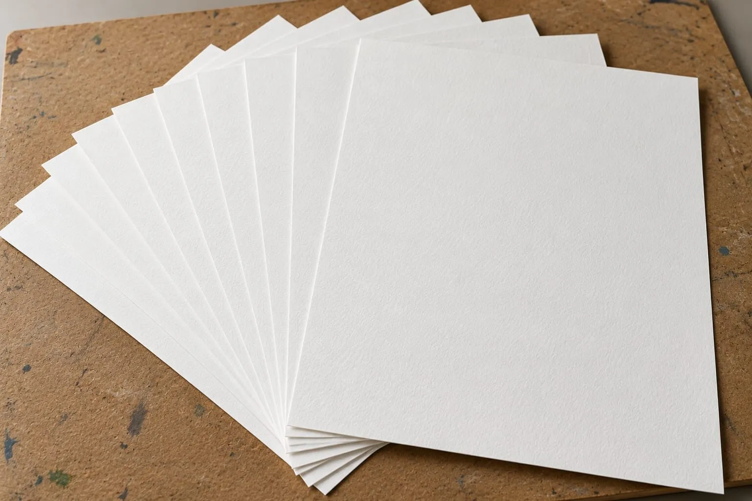
Paper & Surfaces
Why Use Grey Paper for Coloured Pencil?
Grey paper gives coloured pencils (colored pencils in the US) a mid-tone to work from, so highlights glow and shadows deepen. When grey beats white.
This guide contains affiliate links. If you buy through them we may earn a small commission at no cost to you. How this works.
Jump to recommended products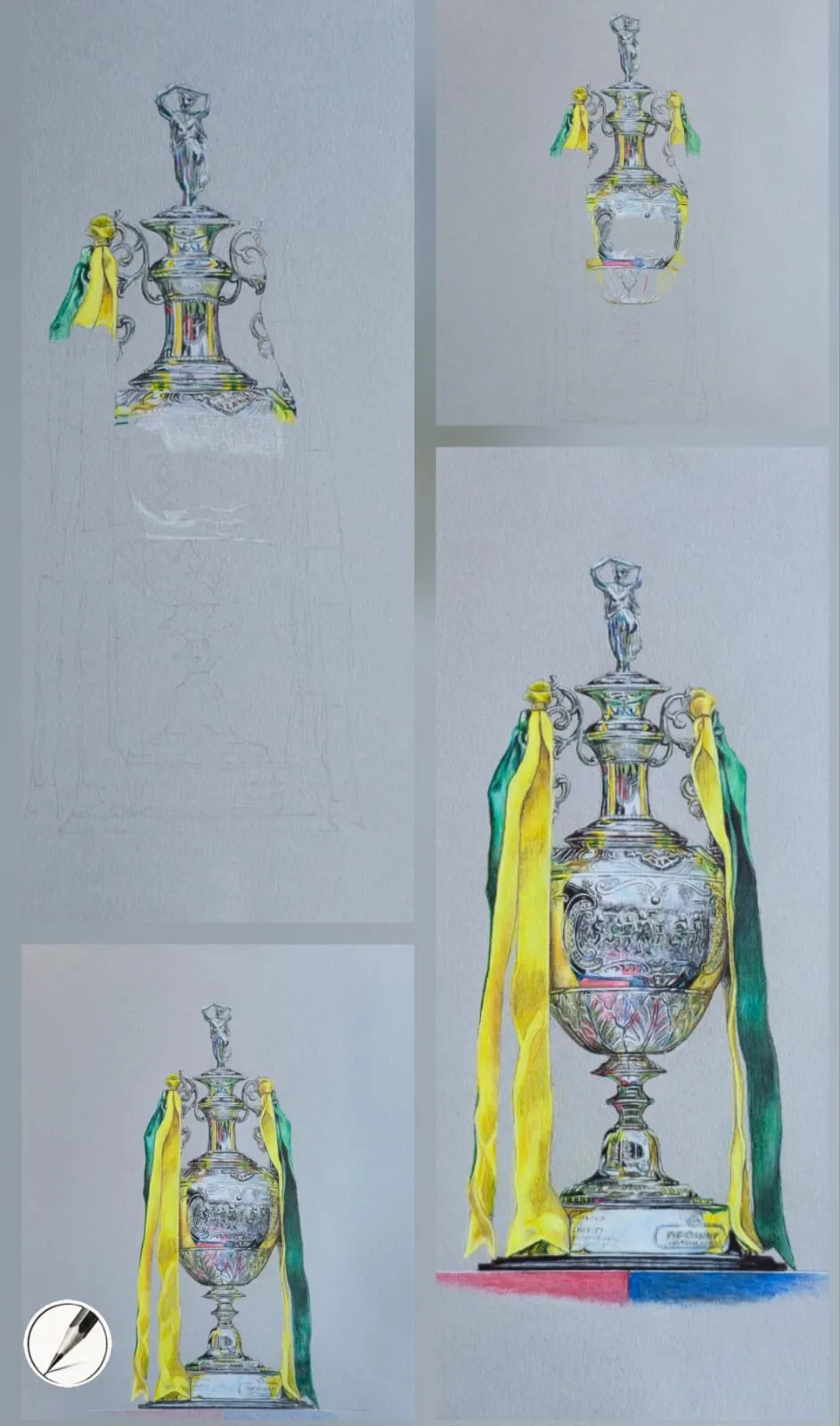
Key takeaways
- ◆A mid-tone grey paper gives you a head start: you build both lights and darks instead of only darks.
- ◆White pencil sits on top of grey and reads as a true highlight - something white paper cannot do.
- ◆Grey suits glossy, reflective subjects best: metal, glaze, icing and glass.
- ◆Choose a heavier paper with some tooth so it survives many layers and lifting.
- ◆White or cream paper is still the better choice for warm, soft subjects such as skin and fur.
Most people learn to draw on white paper, and for many subjects it is the right choice. But if you have ever struggled to make a drawing look shiny - a piece of metal, a glazed doughnut, a wet cherry - the paper may be working against you. Switching to grey can change the result more than any pencil upgrade.
This guide explains what grey paper actually does, when it beats white, when it does not, and how to choose one that will survive serious layering. This applies to coloured pencils, or colored pencils in the US. White pencils matter most on grey, so see best white pencils for drawing on grey paper, and for an even darker ground read drawing on black paper.
What grey paper does for a drawing
On white paper, every mark you make is a shade darker than the surface. Your lightest tone is the paper itself, so you can only add darkness. That is natural for soft, warm subjects, but it makes bright highlights difficult: you have to leave white paper untouched and protect it through the whole drawing.
On a mid-tone grey, the situation is reversed. The paper already sits in the middle of your tonal range, so you work in two directions at once: darker pencils build the shadows, and light pencils - especially white - build the highlights. Both directions are additions, and you can add them in any order.
That has three practical effects:
- A wider usable value range. You get real darks and real lights without starting from either extreme.
- Highlights that glow. A crisp white mark on grey looks brighter than untouched white paper ever can, because your eye compares it with the mid-tone around it.
- Cohesive colour. The grey shows through your layers and unifies the whole drawing, which quietly helps colours harmonise.
The best subjects for grey paper
Grey paper earns its place with anything glossy, wet or reflective. Highlights are the whole story with these subjects, and grey makes them easy.
- Metal and chrome - trophies, cutlery, jewellery, coins.
- Glazes and icing - doughnuts, glossy pastries, sticky sauces.
- Glass and water - bottles, droplets, reflective surfaces.
- Plastic and polished surfaces - toys, car paint, ceramics.
- Dramatic lighting - anything with strong contrast between deep shadow and bright light.
The secret with glossy surfaces is restraint. A convincing shine comes from a handful of crisp, high-contrast highlights on top of simple, smooth mid-tones - not from adding more and more white. Build the base tones fully first, from deep shadow to soft mid-tone, then place the highlights last. Highlights only look bright when everything around them is darker. We cover the full method in how to draw glossy surfaces.
When white or cream paper is better
Grey is not always the answer. For subjects that need warmth and soft transitions, white or cream paper tends to work better:
- Animals and fur, where warm underlayers matter.
- Portraits and figures, especially with delicate skin tones.
- Full-frame compositions that fill the page, like a film still.
- High-key drawings where the lightest tones need to be genuinely pale.
Smooth white and cream papers such as hot press watercolour paper suit these subjects because they allow seamless blending. If you are undecided, our guide to the best paper for coloured pencils compares the main options side by side, and when to use cartridge paper covers the white alternative in detail.
What to look for in a grey paper
Not all grey paper is equal. Three qualities matter most.
1. Weight
Paper weight is measured in gsm (grams per square metre) and simply describes how thick and sturdy the sheet is. Lighter papers - around 120 to 180 gsm - are flexible and good for sketching, but they can buckle or wear down under heavy coloured pencil layering. Heavier papers feel more like card: they stay flat, resist damage and let you build dozens of layers without the surface breaking down.
Michael works on heavy paper of around 300 gsm for exactly this reason. Mid-weight grey papers, roughly 200 to 250 gsm, are a little more flexible and easier to blend on, but they are also less resilient if you erase repeatedly. Our guide to paper weight explained goes deeper, and the paper size and weight converter turns gsm into lb if you shop in US sizes.
2. Tooth
Tooth is the texture of the paper - the tiny hills and valleys that catch pigment. A paper with strong tooth grips layer after layer and keeps colour vibrant, which suits heavily built, glossy drawings. A smoother paper produces a finer, more painterly finish but fills up faster. Read more in smooth versus textured paper.
3. The grey itself
Greys vary from pale silver to deep charcoal. A light to mid grey gives you the most room in both directions and is the best place to start. A darker grey produces drama and moody lighting, but you will lean heavily on white and light pencils to lift the subject out.
Choosing light, mid or dark grey
The grey you pick sets the whole tonal key of the drawing, so it is worth choosing deliberately.
- Light grey leaves plenty of room for darks and suits softer, more delicate subjects. Your white highlights show less contrast against it, so the effect is gentler.
- Mid grey sits in the middle of your range and gives the most freedom in both directions. It is the safest choice for glossy still life, and the best place to start if you are new to toned paper.
- Dark grey gives drama and moody lighting. You will lean heavily on white and light pencils to lift the subject out, and dark shadows need to be pushed further to read as deeper than the paper. It rewards planning and confident highlights.
A useful rule is to match the paper to the average value of your subject. A subject that is mostly mid-tone, such as a glazed pastry, sits naturally on mid grey. A subject that is mostly dark and dramatic, such as a bronze figure in low light, can take a darker ground.
A worked example: building a glossy dessert on grey
Here is how the method looks in practice on a subject such as a chocolate dessert with a glossy sauce. Michael’s approach is to work from the layout to the detail, building colour gradually.
- Lay out the shapes. Draw the outlines lightly so they can be absorbed into later layers.
- Block in the darkest darks. Establish the deepest shadows and the core of the sauce first. On grey, these already read against the mid-tone.
- Build the mid-tones smoothly. Layer browns and warm reds with light pressure until the surfaces look simple and even. This is the foundation of the shine.
- Add reflected colour. Glossy surfaces pick up their surroundings, so a hint of warm colour in the shadow edge helps the form.
- Place the highlights last. Use a few crisp white marks, tinted slightly with the surrounding colour, on the brightest points only.
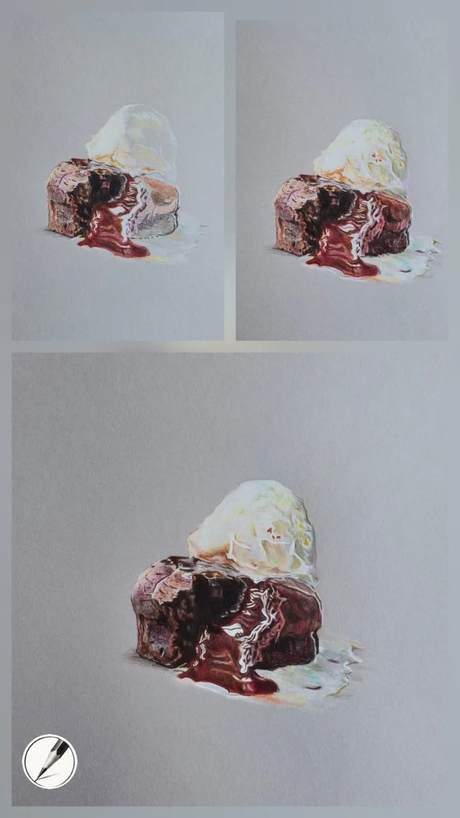
Layering creates shine: each stage adds simple tone before the highlights arrive.
Notice that the highlights are the smallest part of the process. The shine comes from how dark and smooth the surrounding tones are, which is why the sequence matters more than the pencil.
Grey versus white versus cream
| Grey | White | Cream | |
|---|---|---|---|
| Starting value | Middle | Lightest | Light and warm |
| Highlights | White pencil sits on top | Leave paper bare | Leave paper bare or add white |
| Best for | Metal, glaze, icing, glass, drama | Portraits, botanical, high-key work | Warm subjects, skin, gentle scenes |
| Main risk | Hiding value mistakes | Lost highlights | Warm cast on cool colours |
Common mistakes on grey paper
- Adding white too early. Early white muddies your darks and takes away the contrast highlights need. Save it for the end.
- Overusing white. Too many highlights make a surface look busy or plasticky rather than wet.
- Ignoring warmth in highlights. A warm glaze often has a hint of orange or pink in its highlight, not pure white.
- Not checking values. The grey can make everything look acceptable, so squint or convert to greyscale.
- Pushing colour without testing. Some colours appear duller or shift over grey. A swatch card shows what will happen before you commit.
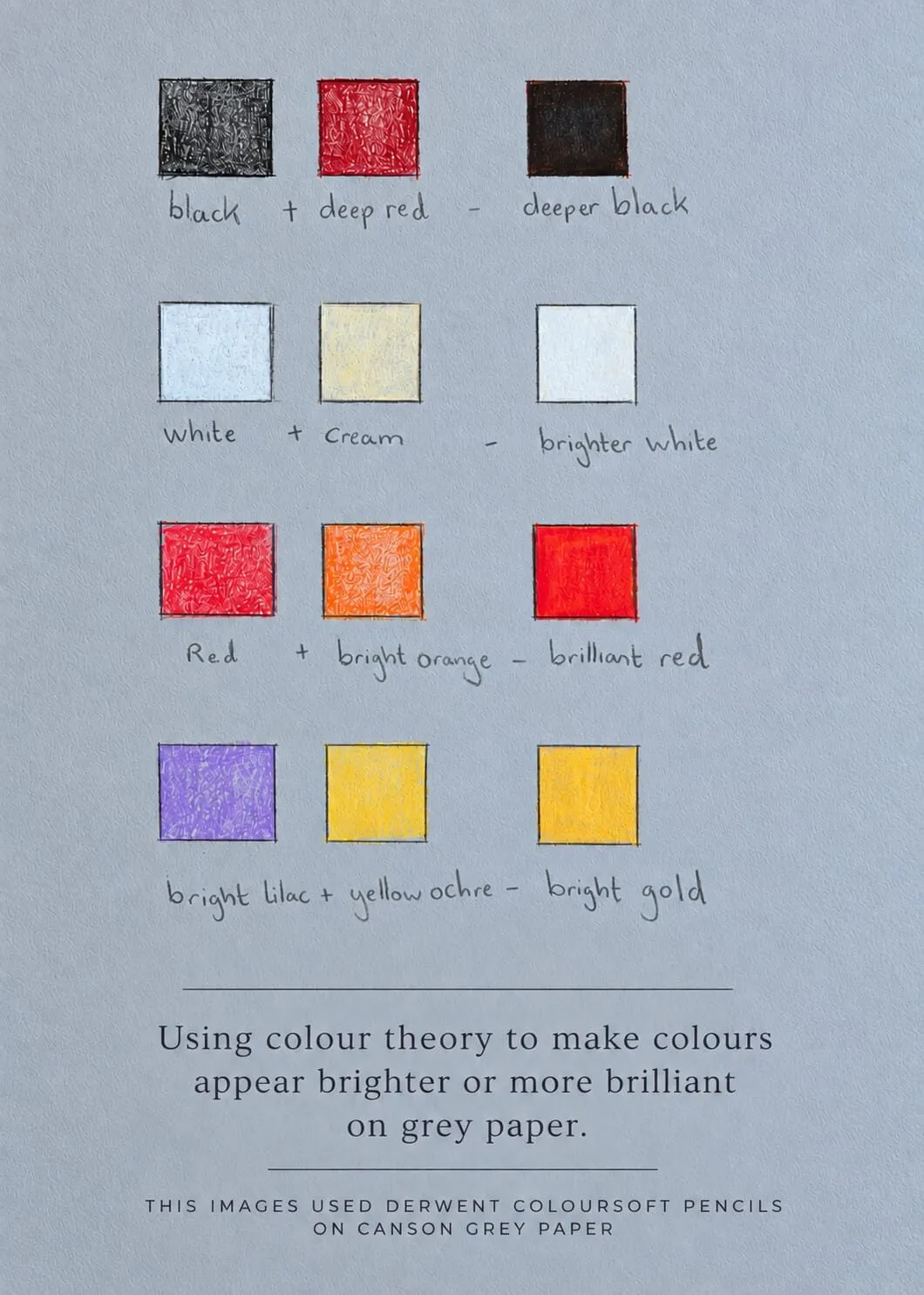
A swatch card on grey paper: pairing colours, such as white with cream, makes them read brighter. The theory is covered in colour theory on grey paper.
Grey papers worth trying
These are the grey papers Michael has used and the ones we suggest testing first.
Canson Mixed Media grey is a textured, durable paper with a strong grain that lets pencils layer well and hold their colour. It is a good all-round choice for glossy still life and copes well with corrections. Michael’s summary is that the grain, or “teeth”, is what lets pencils layer well and maintain their colour.
Clairefontaine Paint’On Gris is darker and more painterly, with broader areas of contrast and a subtle drag under the pencil. It suits atmospheric, dramatic drawings.
Art Gecko grey sketchbooks are softer, which encourages looser, more expressive marks. They are well suited to studies and portraits where a paint-like finish works well, though they are a little less resilient if you erase heavily.
Tips for drawing on grey
- Test first. Swatch your pencils on a scrap of the paper. Colours behave differently over grey, and some pale pencils barely register.
- Keep a strong white. An opaque white pencil is your highlight tool. Buy the best one you can.
- Use the grey as a mid-tone. Leave areas of paper showing where the subject is naturally mid-value. That is free tone and it keeps the drawing harmonious.
- Place highlights last. Wait until the darks and mid-tones are settled, then add the brightest marks.
- Squint often. Grey paper can hide value mistakes, so check your drawing in greyscale or use the value study tool.
The short version
Choose grey paper when the subject is shiny, wet or dramatic. Choose white or cream when the subject is soft, warm or delicate. Whichever you pick, buy heavier paper with a little tooth, and you will have room to build the layers realism demands.
Where to buy
Recommended products
Affiliate links. We may earn a small commission if you buy, at no extra cost to you. Why?
Paper · Canson
Canson Mixed Media Grey Paper
A toothy mid-tone grey paper that grips pigment and makes highlights glow.
Paper · Clairefontaine
Clairefontaine Paint On Gris
A darker grey paper with a painterly drag - atmospheric for dramatic lighting.
Buy on AmazonAffiliate link · opens Amazon
Paper · Art Gecko
Art Gecko Grey Sketchbook
A grey-toned sketchbook that suits looser, expressive studies and portraits.
Buy on AmazonAffiliate link · opens Amazon
Quick answers
Frequently asked questions
Do I need special pencils for grey paper?+
No. Any wax-based or oil-based coloured pencil works, but a good white pencil matters more than usual because you will use it for highlights. Opaque, creamy pencils cover the grey most effectively.
Is grey or toned paper harder to use than white?+
It is different rather than harder. Because the paper is already a mid-tone, you judge values relative to it, which many artists find intuitive. You just need to remember that the white of the paper is no longer available for your lightest lights.
What is the best grey paper for coloured pencil?+
It depends on the subject and your budget. Textured mixed media grey papers grip pigment well for layering; smoother grey papers give a finer finish. See our full paper comparison for detail.
Are colored pencils and coloured pencils the same?+
Yes. Coloured pencils is the UK spelling and colored pencils is the US spelling, and they are the same product. The grey paper advice applies to both.