Graphite & Charcoal
How to Draw Realistic Textures in Graphite
A practical method for drawing skin, fur, wrinkled hide, scales, fabric, metal and wood in graphite: observe, simplify, follow direction and control contrast.
This guide contains affiliate links. If you buy through them we may earn a small commission at no cost to you. How this works.
Jump to recommended products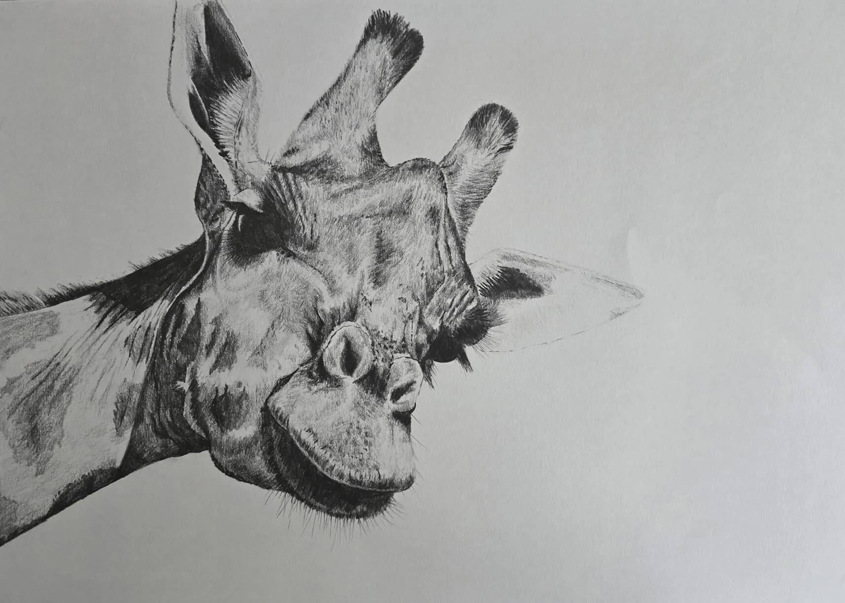
Key takeaways
- ◆Every texture is a pattern of light, shadow, direction and edge; learn to see those four things and you can draw any surface.
- ◆Simplify first: block in the big value shapes, then add texture only where it earns its place.
- ◆Strong value contrast makes texture read; too much detail at even tone looks flat.
- ◆Follow the direction of the surface with your marks, and vary edges between crisp and soft.
- ◆Different textures need different tools: sharp points for scales, soft layered tone for skin, and an eraser for highlights.
A drawing looks real when the surface looks real: you can almost feel the roughness of a crocodile’s back, the softness of hair or the slippery cold of metal. Texture is what separates a convincing drawing from a correct-but-flat outline, and it is one of the most satisfying skills to develop in graphite because the medium is so good at it.
The good news is that texture is not a bag of separate tricks. Almost every surface can be drawn with the same approach. This guide sets out that approach, then applies it to skin, fur, wrinkled hide, scales, fabric, metal and wood, using Michael’s graphite animals as examples. To build the underlying skills, you may want to practise shading and hatching first.
The five-step approach to texture
1. Observe
Before you draw a mark, look at how the texture behaves. Ask five questions:
- Where is it light and where is it dark? Texture is made from tiny highlights and shadows.
- Which way does it go? Fur grows, scales overlap, wood has grain, cloth folds.
- Is it regular or irregular? A brick wall repeats; skin does not.
- How sharp are the edges? Metal has crisp reflections, skin has soft transitions.
- Where is the detail concentrated? Usually in the focal area and in the light.
Squint to reduce the surface to big value shapes and see the pattern before the detail.
2. Simplify
Block in the overall form and the big value shapes first, lightly. If you start with detail, you will place texture without a form to hold it, and the drawing will look decorated instead of solid. Establish the light side, shadow side and cast shadow, then add texture on top.
3. Follow the direction
Your marks should move in the direction of the surface. Curved strokes on a curved form, tapering strokes for hair, short overlapping marks for scales. Direction is the fastest way to suggest structure and to make texture read as part of the form rather than a pattern laid over it.
4. Build value contrast
Texture only reads if there is contrast between the lights and darks that make it. A wrinkled surface at an even mid-grey looks flat; deepen the crevices and keep the ridges light and it comes alive. Use soft grades for the deepest shadows, and keep highlights clean, lifting them with an eraser if necessary. Use the value study tool to check that your texture reads in greyscale.
5. Control edges
Vary the edges between crisp and soft. Sharp edges pull attention forward; soft edges recede. A convincing texture uses a mix: hard edges where light strikes a ridge, soft ones where surfaces turn away. Blending can soften edges, and a sharp point can define them. See how to blend graphite for softening tools.
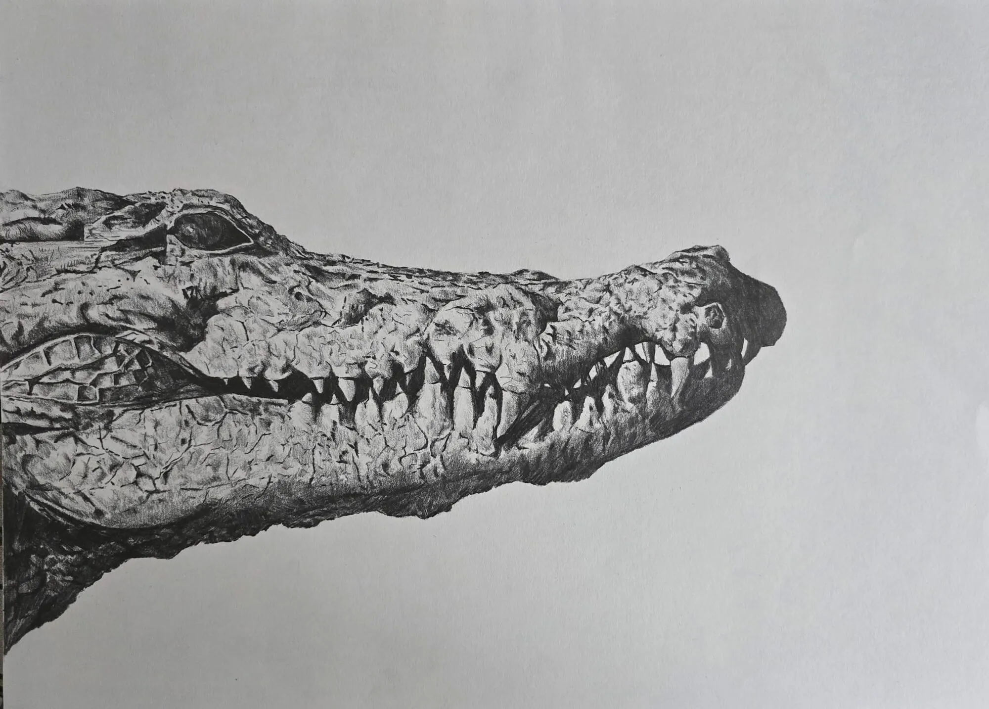
A crocodile’s head and teeth drawn in graphite pencil. Drawing by Michael Brace.
Skin
Skin is smooth, with subtle variation in tone, and it is best built with soft layered shading rather than lines. Use a mid to soft grade, light pressure and many layers, blending lightly with a stump or tissue for smooth transitions. Add small marks for pores, wrinkles and freckles sparingly, since overdone skin texture looks aged and harsh.
Keep the lights clean and let the gradation carry the form. Around the eyes, mouth and nose, where the skin creases, use sharper edges and darker tone. See our guide to how to shade with pencil for the layering technique behind smooth skin.
Fur and hair
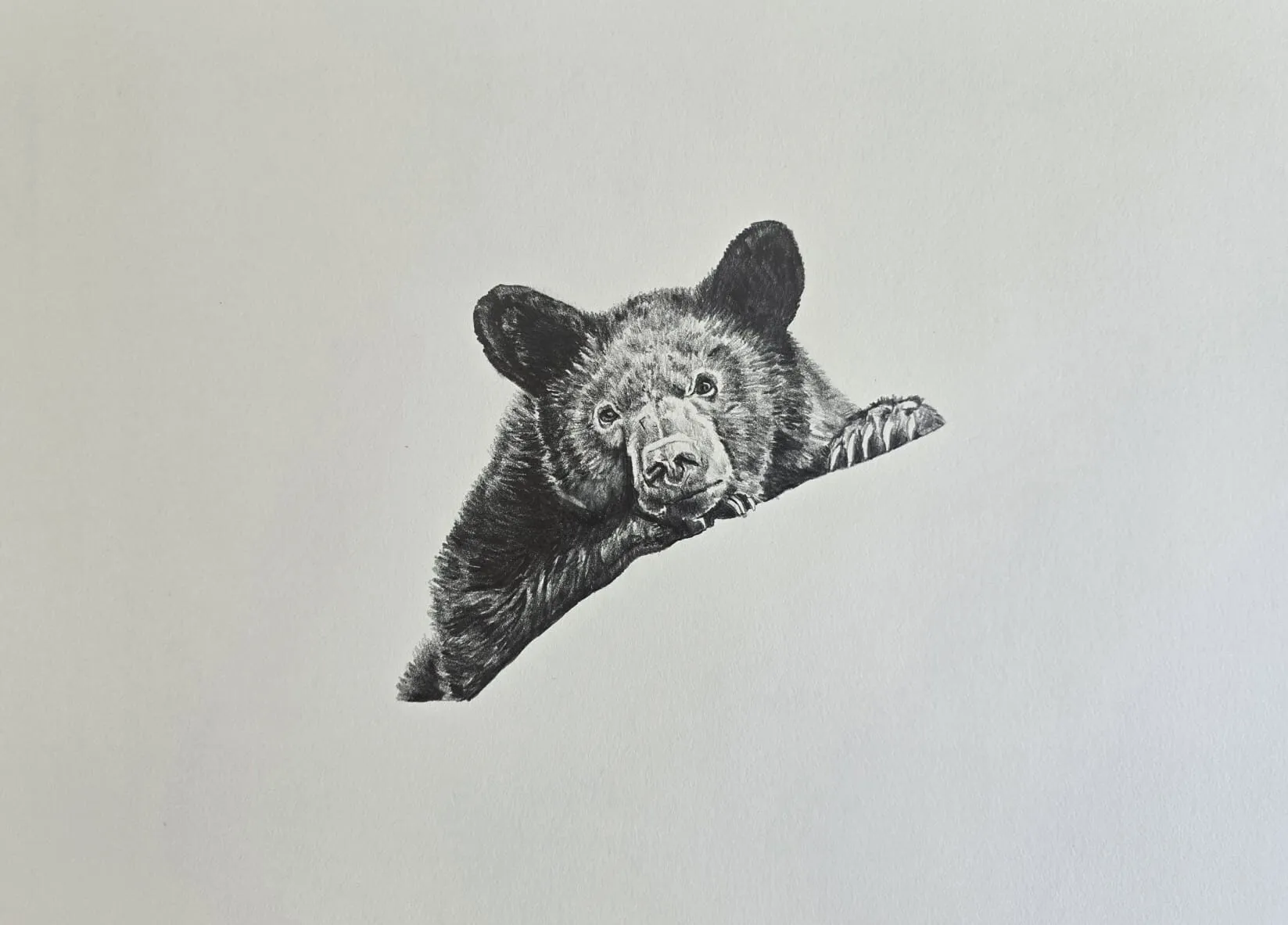
Fur combines direction, layering and edge control. Work in three stages:
- Base tone. Lay in the dark shapes and general shading with a soft pencil, following the direction of growth.
- Hair strokes. Add fine strokes with a sharp pencil, flicking outward so each stroke tapers. Vary length and pressure.
- Highlights. Lift light hairs out with a sharp edge of a kneaded or precision eraser, and leave some paper clean.
Keep the strokes following the flow of the fur across the body, and use clumps rather than individual hairs. Edges of fur against the background should be broken and irregular, not a smooth outline.
For a deeper look at fur in coloured pencil, which shares some principles, see how to draw animal fur.
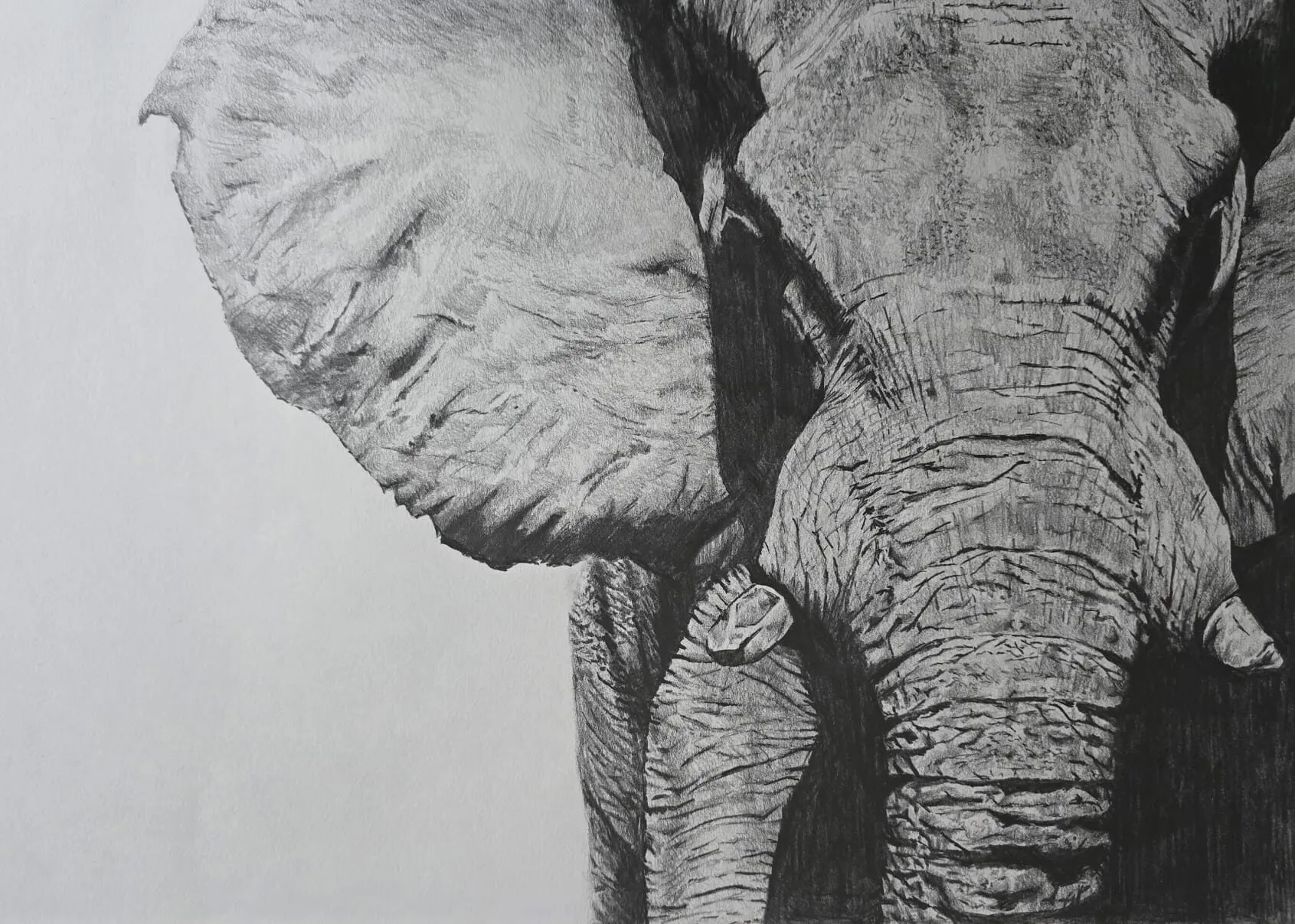
A close-up of an elephant’s ear, trunk and skin drawn in graphite pencil. Drawing by Michael Brace.
Wrinkled skin: the elephant
An elephant’s skin is a study in ridges and creases, and it makes an excellent texture exercise. Think of it as a landscape of hills and valleys.
- Map the big folds first. Identify the main creases and how they follow the body’s form.
- Darken the creases. The deepest folds are dark, connected shapes rather than isolated lines. Use a soft pencil and build tone gradually.
- Keep the ridges lighter. The raised skin catches the light, so leave it lighter, adding small cracks and fine lines rather than heavy tone.
- Add fine texture last. Small wrinkles and cracks across the ridges give the skin its rough quality. Use a sharp pencil and short, curved marks.
- Use a full value range. Wrinkled skin needs strong contrast from deep shadow to bright highlight to look three-dimensional.
Scales
Scales overlap in a regular but irregular pattern, and they change size and shape as they follow the form. On a crocodile, the large armoured plates along the back differ from the smaller scales on the flank and belly.
To draw scales:
- Block in the form and shadow first, with soft, smooth tone.
- Sketch the scale pattern lightly, curving the rows to follow the body and making scales smaller and closer where the form turns away.
- Shade each scale with a darker edge on one side and a lighter centre or highlight, following the light direction.
- Deepen the gaps between scales with a soft, sharp pencil.
- Vary the pattern. Real scales are not identical. Vary size, spacing and tone across the surface.
Detail is strongest in the light and focal area, and simplified in the shadow so that the form is not lost. Regular patterns can look mechanical, so break them up with variations in tone and occasional imperfections.
Fabric
Fabric is defined by folds, and folds are defined by light and shadow. Identify where the cloth is pulled tight, where it hangs and where it gathers.
- Draw the main folds as value shapes. Look for the light plane, the shadow plane and the cast shadow within the fold.
- Vary edges. Sharp folds have crisp edges; soft folds have gradual transitions.
- Follow the weave. Fine fabrics such as silk have smooth, sharp highlights; heavy fabrics such as wool or knit have soft edges and visible texture.
- Use contour hatching to wrap tone around the folds.
Simplify pattern and weave, drawing enough to suggest the material and letting the folds carry the form.
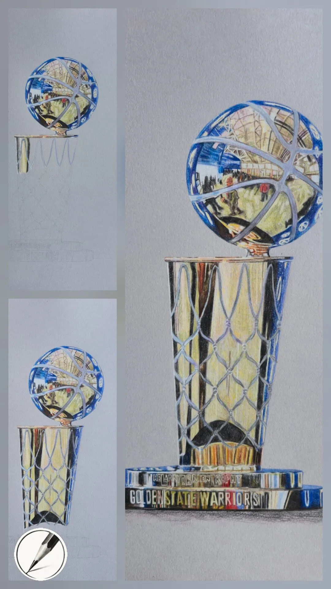
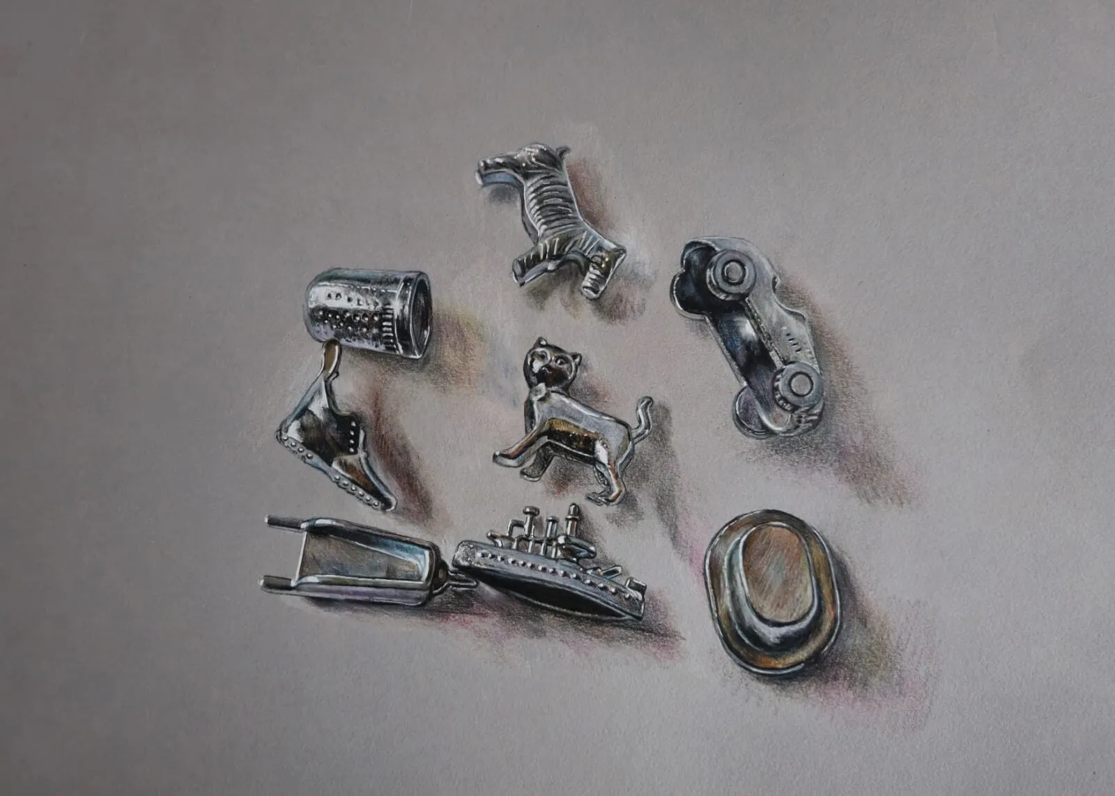
Metal
Metal is defined by reflections. Its look is a series of sharp contrasts between light and dark, with few mid-tones.
- Use high contrast. Place very dark and very light shapes next to each other.
- Draw the reflections as shapes, not as detail. Simplify the reflected environment into big value patterns.
- Keep highlights crisp. Lift them with a sharp eraser or leave the paper white.
- Use smooth blending on curved metal for smooth gradients, with hard edges between reflections.
Metal is much easier in graphite when you treat it as an abstract pattern of light and dark shapes and trust the pattern.
Wood
Wood combines grain direction, knots and cracks, with a slightly rough surface.
- Lay in the base tone and form shadow first.
- Draw the grain with long, slightly wavy lines that follow the length of the wood, varying spacing and darkness.
- Add knots and cracks as darker, more distinct shapes, with the grain bending around them.
- Vary the tone along the surface so that the wood is not a uniform pattern.
Aged wood has rougher, deeper grain and cracks; polished wood has smoother tone with soft reflections.
Tools for texture
- A range of pencils. Hard for fine detail, mid for tone and soft for deep shadows. See graphite pencil grades explained.
- Erasers. A kneaded eraser for soft lifts and a precision eraser for fine highlights. Our guide to the best erasers for graphite covers the options.
- Blending tools. Stumps and tissue for smoothing, used sparingly so texture is not lost.
- Paper with tooth. A textured surface such as cold press or a good cartridge helps texture read and holds layers.
Learning from books
Texture is one of the best subjects to study from a dedicated book. Drawing Realistic Textures in Pencil, by J.D. Hillberry, is a book Michael recommends for texture realism, teaching how to create wood, metal, fabric, skin, glass and more using graphite alone. For more reading, see our guide to the best books to improve your drawing.
Common mistakes
- Drawing every detail evenly. Texture everywhere looks flat and busy; concentrate it in the focal area.
- Ignoring the underlying form. Texture that does not follow the form looks stuck on.
- Weak contrast. Without deep shadows and clean highlights, texture will not read.
- Repeating identical marks. Real textures vary; vary your marks in size, spacing and pressure.
- Outlining texture. Hard outlines around each scale or wrinkle look cartoonish; let tone define them.
A practice plan
- Copy a small texture swatch of each material from a photograph: a square of fur, a patch of skin, some wood, some fabric.
- Spend 20 minutes on each, focusing on light, direction and contrast rather than perfection.
- Combine them in a simple still life, such as a wooden table, a cloth and a metal object.
- Apply them to a subject such as an animal, where texture and form work together.
- Compare your results with the source and note what read well and what did not.
If you want to draw from a photograph, the grid drawing tool can help you place the main shapes accurately before you add texture. Our graphite and charcoal guide links to the other techniques that support texture work, and how to draw what you see is a useful companion for improving observation.
Practise these textures in lessons on drawing hair, drawing a dog and drawing a tree.
The short version
To draw a convincing texture, observe the pattern of light, direction and edge, simplify to big value shapes, follow the surface direction with your marks, build strong contrast and vary the edges. Then apply the same method to skin, fur, wrinkled hide, scales, fabric, metal and wood. Put most detail in the focal area, and add texture last.
Where to buy
Recommended products
Affiliate links. We may earn a small commission if you buy, at no extra cost to you. Why?
Book · J.D. Hillberry
Drawing Realistic Textures in Pencil
A graphite master's guide to wood, metal, fabric, skin and glass.
Buy on AmazonAffiliate link · opens Amazon
Quick answers
Frequently asked questions
How do you draw realistic textures with pencil?+
Observe the texture's pattern, simplify it into big value shapes, then add detail in the direction the surface grows or bends. Use strong contrast between light and shadow, vary edges from hard to soft, and lift highlights with an eraser. Texture reads best when it is suggested in the focal area and simplified elsewhere.
How do I draw fur in graphite?+
Lay in the dark shapes and general tone first, then add hair strokes that follow the direction of growth, curving with the form. Vary the length and pressure of the strokes, leave lighter gaps for highlights, and lift light hairs with a sharp eraser. Detail is strongest at the edges and in the focal area.
How do I draw wrinkled skin like an elephant's?+
Treat wrinkles as ridges and valleys. Draw the deep creases as dark, connected shapes, keep the raised ridges lighter, and let the folds follow the form of the body. A wide value range is essential, and soft, layered tone with a few sharp darks in the deepest folds gives convincing depth.
What pencils are best for texture?+
Use a spread from hard to soft. Hard pencils give fine lines for detail such as scales or wood grain, mid grades build general tone, and soft grades add deep shadow. A kneaded eraser and a precision eraser for highlights matter as much as the pencils. Paper with some tooth also helps texture read.