How to Draw
How to Draw Mountains and Landscapes in Pencil
Learn to draw mountains and landscapes: planes of distance, atmospheric perspective, values, edges, foreground detail and skies, in graphite or coloured (colored) pencil.
Key takeaways
- ◆Divide a landscape into planes (foreground, middle ground and background) and treat each as a separate value and detail level.
- ◆Atmospheric perspective makes distant things lighter, cooler, softer and lower in contrast, and it is the quickest way to create depth.
- ◆Mountains are built from big simple value shapes first, with ridges and texture added late.
- ◆Sharp edges and strong contrast belong in the foreground, while edges soften and fade with distance.
- ◆The sky sets the light for the whole scene, so draw it to match the direction and mood of the landscape.
A landscape can feel overwhelming, because there is so much in it. The way through is to simplify. Split the scene into a few planes of distance, give each plane its own value and level of detail, and let atmospheric perspective do the work of creating depth. Draw mountains as big, simple masses of light and shadow first, and save the texture for last.
This lesson gives a method for graphite and for coloured pencil (colored pencil in the US): planes of distance, atmospheric perspective, values, edges, foreground detail and skies.
What you need
- Graphite: 2H or H for light distant tones, HB and 2B for the middle ground, and 4B or 6B for dark foreground. The pencil grade chart explains the range.
- Paper: medium tooth works well for texture in grass, rock and snow. See best paper for graphite drawing for options.
- Coloured pencils: blues, violets and cool greys for distance, and warmer greens, ochres and browns for the foreground.
- Reference: your own photographs or sketches. The grid drawing tool helps you transfer a complex view accurately.
- A viewfinder: a card with a rectangular window, which helps you choose a crop.
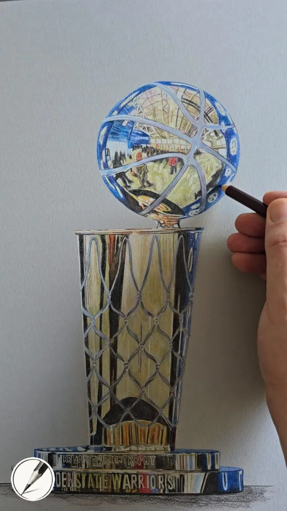
A hand adding detail to a trophy drawing in coloured pencil on grey paper. Drawing by Michael Brace.
How to draw mountains and landscapes step by step
1. Choose a composition
Decide what the picture is about, and crop to it. A viewfinder or your fingers framed in a rectangle are enough. Place the horizon off centre, about a third of the way up for a dramatic sky or a third of the way down for a big land. Look for a path, river, fence or ridge line that leads the eye in, and avoid cutting the picture in half with a level line.
2. Make a small value thumbnail
Before the main drawing, make a thumbnail about the size of a postage stamp. Block in the picture with three values only: light, mid and dark. This tells you if the composition works and where your darkest darks should be. The value study tool gives you a quick way to simplify a photograph the same way.
3. Divide the scene into planes
Lightly mark the foreground, middle ground and background. In a mountain scene these might be rocks and grass in front, a forest or lake in the middle, and ridges behind. Each plane gets its own treatment. The foreground has the strongest contrast and the most detail, the middle ground has medium contrast and medium detail, and the background is pale and simple.
4. Draw the main shapes
Sketch the ridge lines, hills, water edges and large shapes with light, loose lines. Make sure the mountains overlap, because overlaps give a strong sense of distance. Do not add detail yet. A common fault is to start with crisp lines in the distance, which pushes the mountains forward.
5. Block in the big values
Shade the large areas before any texture. Start with the sky, then the distant mountains at a light value, then the middle ground, and finally the foreground at the darkest. Each plane should be separated from the next by a clear step in value. In graphite, use the side of the pencil with light pressure and build gradually, following how to shade with pencil.
6. Apply atmospheric perspective
Move each plane further away by making it lighter, cooler and softer. The farthest mountains may be only a couple of values darker than the sky, with no detail at all. In coloured pencil, use pale blue, violet or blue-grey for distance, and warm greens and browns for near ground. Read colour temperature: warm and cool for why this works, and use the colour scheme generator to plan a limited palette.
7. Model the mountains
Now turn the flat mountain shapes into forms. Decide where the light comes from, then shade the planes facing away from it. Large slopes are built from several flat planes meeting at ridges, so look for where the ridge turns from light to dark. Use directional strokes that follow the slope, and keep lit faces pale. Only add a few key ridges and gullies, and let the rest stay as suggestion.
8. Vary your edges
Use crisp edges where two values meet in the foreground, and soft or lost edges in the distance, where mist and air blur the line. A ridge against a pale sky may need a hard edge at one point and a softer one where it fades into cloud. Varying edges is what makes the landscape feel natural, and it matches how your eye sees.
9. Add foreground detail
Bring the foreground forward with texture. Use sharper strokes for grass, darker gaps between rocks, stronger shadows and a few clear individual elements, such as a rock, a fence post or a clump of reeds. Keep the detail largest and sharpest at the bottom of the picture and let it reduce towards the horizon. The same idea works in a snow scene, where small darks such as tracks, posts and animals add scale.
10. Finish with the sky and unify
Finish the sky so it matches the light on the land. If shadows fall to the right, the sun is on the left, and the clouds and brightest part of the sky should agree. See how to draw clouds and skies. Finally, step back, and strengthen the darkest darks and lightest lights where the eye should go.
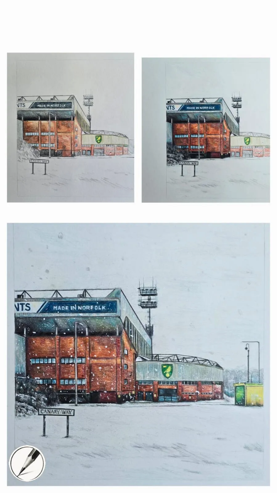
Michael’s snowy stadium in three stages: layout, base colours and final detail. Working from large shapes to detail is the same order that suits a landscape.
Values and depth
Values do most of the work in a landscape. A useful rule of thumb is that contrast is greatest near the viewer and lowest in the distance. That means the darkest dark and the lightest light usually sit in the foreground or the focal point, and the background keeps to a narrow band of mid-to-light values. The value in drawing guide explains how to keep a clear scale.
| Plane | Value | Edges | Detail | Colour (if coloured) |
|---|---|---|---|---|
| Foreground | Widest range, darkest darks | Crisp | High | Warm, saturated |
| Middle ground | Medium range | Mixed | Medium | Mid temperature |
| Background | Narrow, light | Soft | Minimal | Cool, muted, pale |
| Sky | Light, graded | Soft | Low | Matches the light |
This is a guide, not a law. Fog, storm light and backlit scenes all change the pattern, but the principle of separating planes by value stays.
Skies and the light of the landscape
The sky is also the light source of the landscape. A bright sky, low on the horizon, gives long shadows and warm light. An overcast sky gives soft, even light with low contrast. Draw the sky lightly first, to establish its value, and come back to it last to adjust. Sky is usually lightest at the horizon and darker overhead, which also pushes mountains back.
Colour in landscapes
In coloured pencil, colour temperature creates the sense of space. Work from the back to the front.
- Lay pale blue or grey-violet for the distant mountains, keeping it smooth and soft.
- Use slightly more saturated blue-green for the middle distance.
- Bring in warmer greens, ochre and brown in the foreground, with darker layers added in the shadows.
- Mute colours with their complements to avoid garish greens, using saturation and muted colours as a guide.
- Keep layers light, so you can adjust and leave the paper showing as snow or cloud.
On white paper, the white of the paper does the work of the brightest snow, so draw the shadows on snow in cool blue and violet rather than grey, and leave the lit snow clean.
Common mistakes
The fix is nearly always to simplify, lighten the distance and strengthen the foreground.
Practice exercises
- Three-value thumbnails: make ten quick landscape thumbnails using only light, mid and dark.
- Layer cake: draw five overlapping ridges, each lighter and softer than the last.
- Edge study: draw one mountain with crisp edges and one with soft edges and compare.
- Foreground rock: draw a single rock in detail with a strong shadow, then place a soft mountain behind it.
- Cool to warm: draw the same scene in coloured pencil with cool distance and warm foreground, and again with the colours reversed to see the effect.
Next steps
Continue with how to draw clouds and skies to finish the top of the picture, or how to draw a tree for foreground elements. If you add a lake, how to draw water and reflections covers it. For the larger picture, see the how to draw hub.
The short version: simplify into planes, make distance lighter, cooler and softer, keep the strongest contrast and detail in front, and let the sky match the light.
Quick answers
Frequently asked questions
How do you draw mountains with a pencil?+
Start with the big outline of the ridge line, then divide the mountain into large light and shadow planes using the direction of the light. Shade the shadow planes first, keep the lit sides pale, and add ridges and texture last. Make distant ranges lighter and softer than nearer ones to create depth.
What is atmospheric perspective?+
Atmospheric perspective is the effect where distant objects look lighter, cooler, hazier and lower in contrast because of the air between you and them. In a drawing you create it by using paler values, softer edges, less detail and cooler colours for things that are far away.
How do you make a landscape drawing look deep?+
Use overlapping shapes, a clear foreground, middle ground and background, and atmospheric perspective. Put the strongest contrast and most detail in the foreground, reduce both in the middle ground, and keep the background pale and simple. A strong diagonal, path or river leading in also helps.
Are colored pencils and coloured pencils the same?+
Yes, colored is the US spelling and coloured the UK spelling. They are good for landscapes because cool blues and violets push distant mountains back while warm greens and browns bring the foreground forward. The steps in this lesson work in graphite as well as in colour.